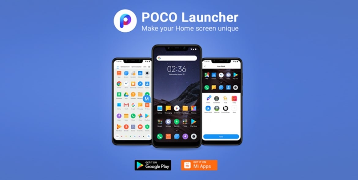
Last year, when Xiaomi launched the Poco F1 smartphone under its new ‘Poco’ brand in India, it also introduced a new user interface — Poco Launcher. Later on, the Android launcher was made available for everyone as it got listed on the Google Play Store.
Now, the Poco Launcher has been updated to a Poco Launcher 2.0 and with this, the Chinese company has also introduced a newly improved design. The changes are aimed at polishing the existing design and make the user experience smoother.

The company has introduced the capability for a semi-transparent background so that users can see wallpaper even under the white/black/gray layer and the transparency setting is customizable.
Just like before, users can still customize pretty much everything and can add applications in groups like Entertainment and Social. However, with the Poco Launcher 2.0, some of the application groups can also be deleted, allowing users to create their own sections.
The company has not revealed anything about the future of the Poco brand given that the company is all set to launch the Redmi K20 and Redmi K20 Pro in India next month. However, there are reports suggesting that the Poco F2 will also get launched.
It will be interesting to see what the company decides regarding the future of Poco, a brand that was created by Xiaomi last year for “affordable flagship” smartphone, aiming to take on the likes of OnePlus. With Redmi K20 series taking on OnePlus 7, let’s see how Xiaomi positions the upcoming Poco F2.
