Microsoft has been trying to update the user interface of its Windows operating system which will start rolling out with the “Sun Valley” update that is expected to make its way to users with Windows 10 21H2 update.
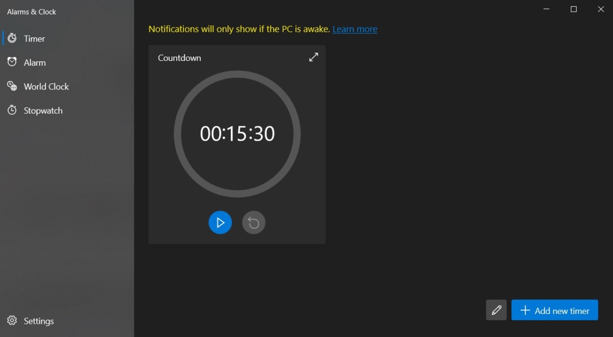
Interestingly, the company has now rolled out an update for an internal application with changes to the user interface that we expect to see in the overhauled user interface, including new elements, rounded corners, animations, etc.

The new update is available for apps like Alarms & Clocks, removing the sharp edges of the elements and replacing them with rounded corners, similar to the UI element of the macOS Big Sur released by Apple.
Similar design consistency is present in the menus, pop-ups as well as the navigation pane. This new updated design is based on WinUI 3 and Fluent Design. This is what we should expect from the upcoming Sun Valley update for the entire operating system.
Further, the app has also been improved, thanks to the addition of floating action buttons, new animations, and an updated UI for the alarm editing as well as the new default timers. There’s also a new card design with better controls.
While the update is still very limited, it hints that the company is on-track to release its updated interface for the operating system next year and from what we have seen so far, the changes seem rather interesting and could improve the user experience.
Ahead of the company rolling out the updated UI for Windows 10 OS, we will get to experience it with the preview builds after a few months. The stable update for the regular users is expected to start rolling out in the second half of next year.

