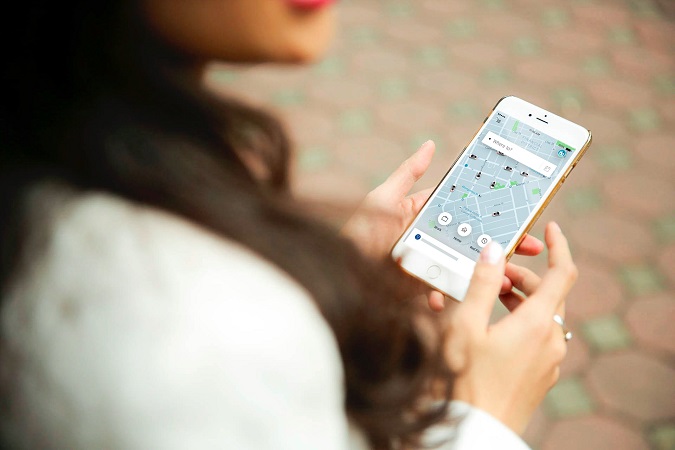
Keeping with the design aesthetics of the app, Uber has now introduced its all new rider app with a “clean and simple” design.

Uber has announced the launch of its revamped rider app with a cleaner interface and overhauled map design. The update brings a refreshed design which is a major change since its last redesign in 2012. The new update is focused to make the app simpler and easier to navigate for all its users.
- Destination First: On launching the app, it asks “Where to?”, to tailor the journey more specifically.
- Shortcuts: The app learns from riders’ routines. Frequent riders would get shortcuts to predict the destination.
- Calendar Integration: the app will also integrate calendar to automatically fetch addresses as “shortcuts” for your meetings and appointments.
- People Search: the app would soon identify the destination by a person instead of the place. Users would just need to sync their contacts with Uber app, and then search the name in the search bar. Once the other user shares the location, the app will pick it up automatically.
- Choose your car & compare upfront fare: User can even compare ride cost with upfront fares for Uber X, Uber Pool, Uber Black or Uber Go.
Speaking about the launch, Yuhki Yamashita, Senior Product Manager, Uber, said, “We designed the new Uber app around you —and our core beliefs that time is a luxury and that the information you need should always be at your fingertips. Gone are the days when everyone’s app looks the same. The new Uber experience is reimagined around a simple question—“Where to?”. After all, you use Uber to get somewhere—or to someone. And by starting with your destination, we can tailor the journey to you.”
