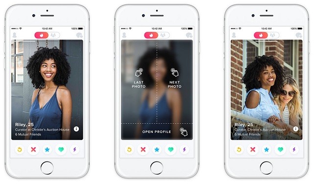
A new update to the Tinder app is bringing modification to the UI of the app. The app is receiving easy navigation, better-looking photos and some changes underneath that will smoothen the app performance.

Consequently, the navigation is now more akin to popular apps like Instagram and Snapchat. Tapping on the right side of a photo in a profile takes you to the previous photo. Tapping on the left takes you to the next photo. On the bottom are the age and details. Tapping that will open the profile.
Moreover, photos now take up more screen real estate and the overall UI makes the app experience a breeze. The app has also been reconstructed inside by replacing Objective-C with Swift programming language. The new navigation will be helped by the new language adoption and make the redesigned app leaner.
Garo Hussenjian, Engineering manager at Tinder said regarding Swift, it’s “no longer the future of iOS development”, but “the present”.
Download Link: Tinder app for Android l Tinder app for iOS
