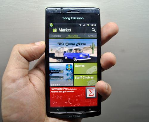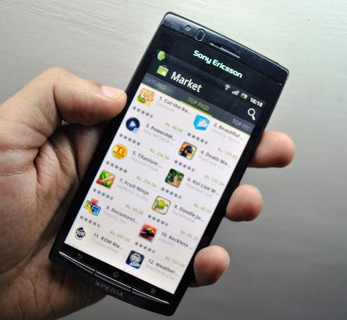
Google had updated its Android Market about month back bringing in a new UI. This new replacement looks cooler, with the whole new side-swipe interface (Metro UI in my mind), and the new double-queue arrangement of the list of apps. I am using the build version 3.1.3 and let me tell you, I am not completely satisfied with the new update and I have certain reasons for that.

First, the old school simple list UI was much better and easy to navigate around. Sure, there isn’t much of a change in the organisation of the list of apps, but it takes forever to load, even on Wi-Fi. I was expecting a new tab for area and country specific apps in the new update which would’ve been much nicer and useful for the users, but Google has still missed it.
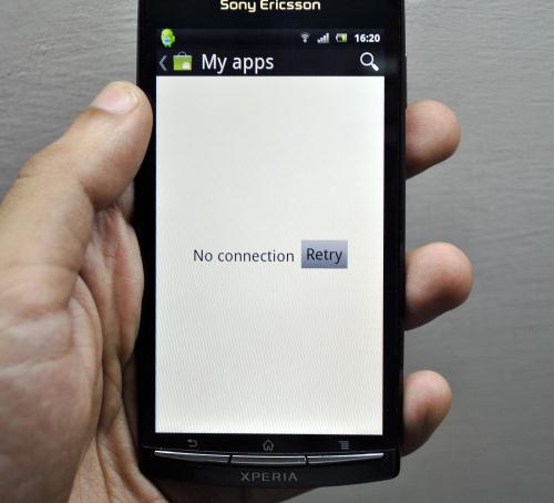
There is although a new security feature of creating a PIN for your account to prevent changes to user control. This is pretty neat if you are concerned about the security of your app downloads. Just create a new PIN, and you’ll be asked to enter your PIN every time you download an app. Oh, and remember how you used to open the Market app and you would get suggestions for you app updates? Well, now you have to manually go in to My Apps and see if there are any updates for your installed apps. And if you happen to go in to My Apps, there is a good chance that you get the ‘No connection’ error.

So to conclude, the new update just brings in new looks. I don’t see much of an improvement in the accessibility and practicality section. The app has a lot of connectivity issues and loads content a bit too slow, could be some cache error or maybe it’s just my handset. I’d rather change back to the older version of the Android Market rather than the sluggish new update.
