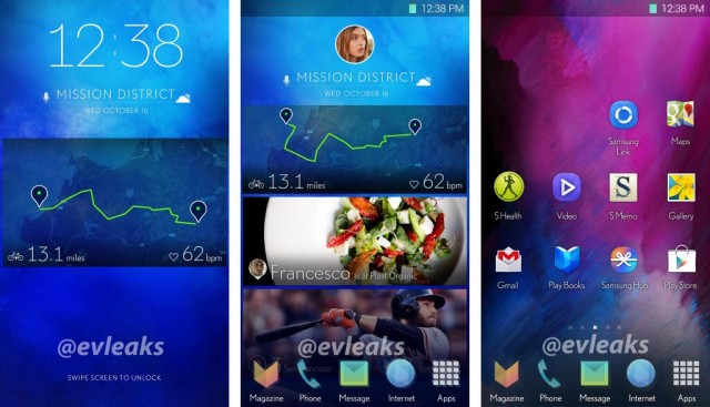
We all have a love-hate relationship with Samsung’s layer on top of Android that is TouchWiz. We love the features and customizations it brings but we hate the eye sore user interface used by Samsung but things might change soon as the ever reliable @evleaks has just posted screenshots of what might be Samsung’s new UI for its smartphones.

The screenshots are of the homescreens which give us a little insight into the way Samsung might be heading with the UI of its Android layer TouchWiz. The icons look a lot cleaner and streamlined. The whole interface kind of looks smoother and flatter and it reminds me a little of iOS 7. We can see what looks like a pretty S Health widget on the homescreen as well along with some sports and food app widgets. All in all the UI doesn’t look like a drastic change from the current TouchWiz but yes it is surely less of an eye sore.The new TouchWiz will surely debut with the much rumored Galaxy S5.
We have been hoping for a TouchWiz overhaul since a long time because the current TouchWiz UI is more or less the same it used to be in the Gingerbread days. Hopefully the new UI may turn out to be a good balance between functionality and looks. Anyways tell us if you like the new UI Samsung might use in the Galaxy S5?
