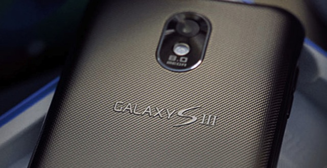
Another set of Galaxy S III rumours are doing the rounds and this time it is related to the traditional Home Screen button, 5 column Note like UI layout and how the Korean giant has managed to keep the design a top-secret successfully.

Now we all know that the rectangular Home-screen button on the Galaxy S devices is so much that all the user’s love. It is something like a tradition. And now when the designing teams of the S III sat for a discussion over whether the S III should have the button or should go with the Galaxy Nexus style on-screen buttons, it was a heated argument.
All the people in discussion divided into two groups but after loads of discussion, it seems that the final design of the Galaxy S III that reached the production unit will arrive with lower consisting of the Home-Screen button but a little smaller than the earlier Galaxy S devices.
Next up is the rumour that Samsung is planning to bring in the 5 column Galaxy Note like UI layout to the Galaxy S III as compared to the 4 columns we have seen on the Galaxy Nexus and other Android flagships. Now this is a nice change from the 4 column TouchWiz interface and will really go well with the S III as the screen size is said to hang on around 4.6 to 4.8 inch. This will look very nice on the 720p Super AMOLED with a normal RGB matrix, which we will see for the first time.
Last but not the least, Samsung has this time been able to keep the design of the Galaxy S III away from leaking thanks to its effort of supplying each carrier with a single rectangular box, which has all the S III software and external port accessible for testing, but all of this minus the exterior design which gives no chances of the design getting leaked. Well played Samsung!
