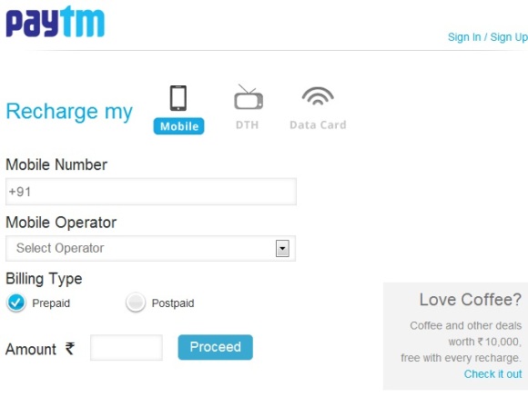
Paytm recently changed its look and we decided to do a quick review of the new Paytm. So what’s new at Paytm, you ask? There is a complete make over of not just the website but the logo as well.

Changes includes :
New design – UI & UX
Better visual imagery – Paytm changes its home page image almost daily. It connotes aspiration and also talks about different Paytm features.
Coupon categorization for convenience

User Interface:
The User Interface now looks much cleaner than before. The website looks pretty neat and the home page image adds an extra flavour to it. There is use of the white color which is predominant over shades of blue and black on Paytm. I must say that, I personally prefer these colors and you can observer the use of same colors on MobiGyaan as well.
The free coupons offered with recharge are now well categorized making it easy for people to choose the required coupons, I was looking for this feature from quite some time, as when there are too many un-categorized coupons it becomes difficult to choose from.
User Experience:
In terms of User Experience a few things are new, but the basic 3 step recharge process still remains the same, which goes like this
1. Enter the number and recharge amount
2. Choose coupons
3. Choose Payment mode and pay
Recharge on the Go:
Apart from the new layout, Paytm also come up with a new server, which infact some of the online recharge portals are already offering. Now Paytm users will now be able to recharge their mobile numbers by a call or SMS.
One most significant change which we felt was that the entire process of recharge is faster than earlier.
We won’t be digging deeper into other aspects as it’s a quick review, let us know what do you feel about the new layout.
