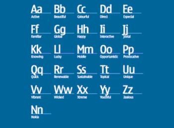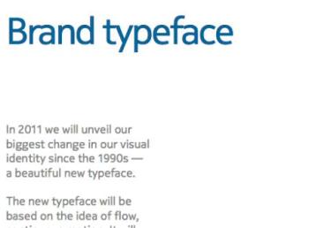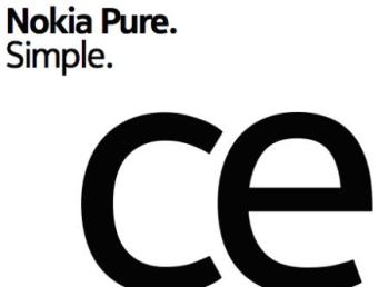
The simple blue font has been the identity of Nokia for many years, and well it has shaped its identity in the global market. Now they have announced a new look for promotion and new typeface (a set of one or more fonts). They believe that the new brand image will be better as they have tried to keep it simple. The newest change is the new font called Nokia Pure.


The Nokia Pure is a typeface is very simple looking and has a flow to it. The typeface is created for Nokia by the branding people. Nokia has always been very fluent and simple in their fonts, as well as interface.
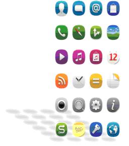
A future reference of what Nokia’s interface might look was unveiled by this image. It is not a new product or interface, but just an idea of what the company is planning for the future. 
The fresh branding and typeface will be out this year and be on the lookout at your billboards, ads and commercials.
