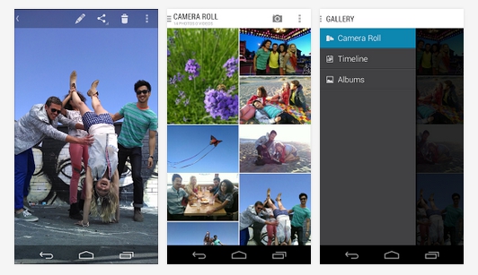
As with Google, expectedly Motorola has been putting their apps on the Google Play Store to get the updates faster to the end user and now surprisingly they have put their very own Gallery app on the Play Store with a few cosmetic changes.

Recently even Sony put their Timeshift burst camera app on the Play Store. Well coming to the Motorola Gallery app, it is not a drastic change from the stock Android Gallery but it does bring some change like in the stock Gallery when you first open it, you are presented awith the albums but in Motorola’s app, you start with a full grid of pictures. Motorola has also removed view options like Location, Tags and left only Photos, Timeline, and Albums.
Motorola has also made some changes to the overflow menu you get in the stock Gallery and they have set the share and the last share button upfront while leaving the rest in an overflow menu. The Motorola app also lets you easily reach the Edit and Delete buttons which is pretty good.
While these are not drastic changes, we can expect more through app updates from Motorola so if you are a Motorola smartphone user, you might want to check the app below by hitting the link below:
