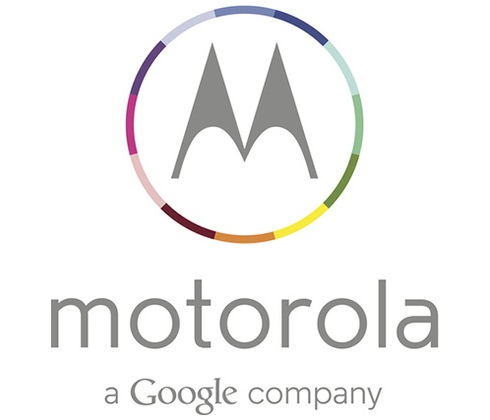
After Google bought Motorola, besides streamlining the company and its products, it has brought a change in its logo also, now with a wheel of colours.

The new Motorola logo has the M is simple grey colour, along with a wheel of colours frequently used by Google. Also the font used for Motorola has also been changed to thinner and lighter font in full lower case, thus giving the logo a plain yet assertive look.
At the bottom of the logo is the label that Motorola is ‘a Google company’. While both Google and Motorola have continuously assured that both the companies will run separately with Motorola retaining its independent status, the recent changes show that Google is still keeping the final say about the Motorola affairs.

