Lenovo announced its latest flagship and first smartphone packing LTE connectivity, the Vibe Z at the end of last year. We were quite impressed by the device back then and we were even more impressed by it when the device came to us in person. It recently launched in India as well. Thanks to the great folks at Lenovo, we recently got a Lenovo Vibe Z to play with and we brought you hands-on images along with my our first impressions of the device.
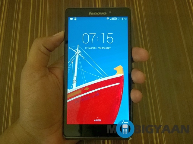
Now, we have had enough time with the device to form a concrete opinion. So, here’s our review. Read on and find out if the Lenovo Vibe Z is worth your money?
Lenovo Vibe Z Specs
- 5.5 inch display
- 1920 x 1080 pixels resolution
- 2.2 GHz Quad-Core Qualcomm Snapdragon 800 processor
- Adreno 330 GPU
- 2GB RAM
- 16 GB internal memory with no microSD expansion
- 13 MP primary camera
- 5 MP front facing camera
- Android 4.3 Jelly Bean
- 3000 mAh battery
What’s in the Box
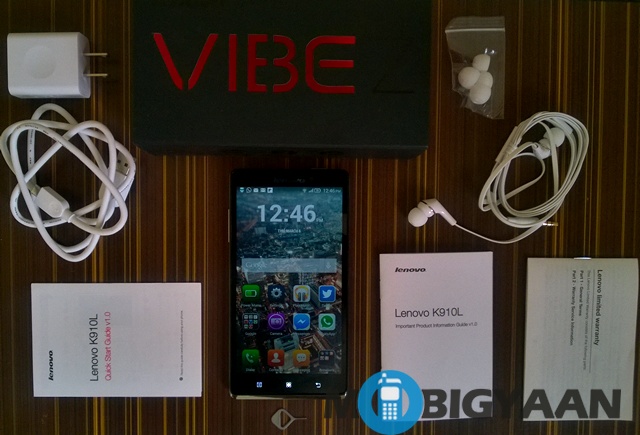
The Lenovo Vibe Z comes in a pretty attractive retail box. Check out the contents of the box below:
- The Lenovo Vibe Z
- micro USB cable
- USB charger plug
- In-ear headset
- SIM ejector tool
- Few booklets of literature
Design and Hardware
Lenovo Vibe Z is the chinese manufacturer’s flagship and it looks every bit a flagship. The device comes in two colors, gunmetal grey and titanium black. We have the gunmetal grey which is basically silver. The Vibe Z is a looker, period!
The first thing we noticed about the device when we got it in our hands is how light it was. It weighs a mere 147 grams and it is quite a pleasure to hold. It is also impressively thin at 7.9mm. The device feels great in the hands, thanks to the matte back and lightweight. The device comes with 16GB internal storage but there’s no microSD expansion which is pretty sad for a flagship.
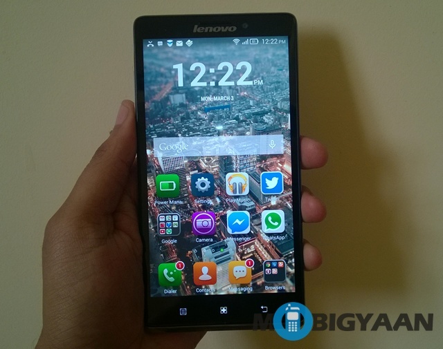
The front of the Vibe Z is all glass with a little silver chin which adds personality to the device. There are the three capacitive buttons below the display, the home button, back button and the menu buttons, which doubles up as the multitasking button. Lenovo has tried the keep the bezels to a minimum and that shows. There’s a small notification LED in the speaker grill at the top along with the 5MP camera and the proximity sensor.
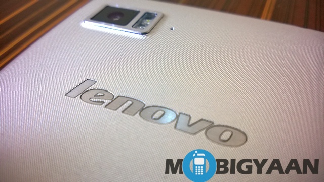
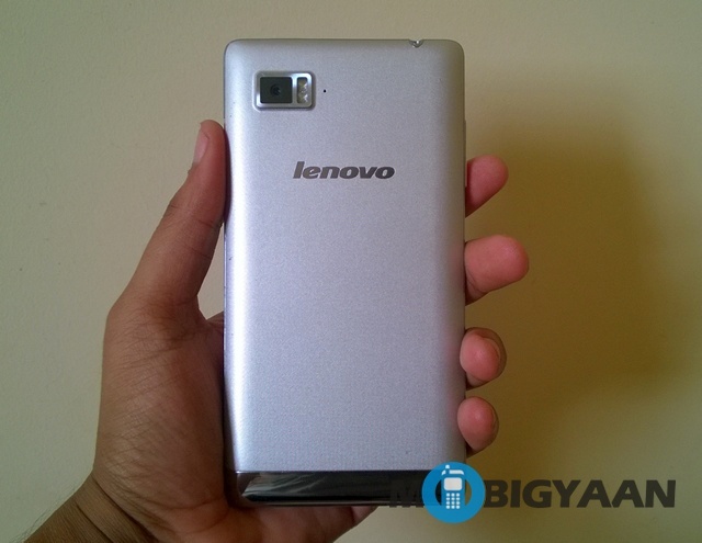
The back is a little flashy but gorgeous nonetheless. It features a laser etched polycarbonate which Lenovo claimed feels like fabric. It feels great in the hands and you can easily mistake it to be metal. It screams premium and surely makes a lot of heads turn and notice the device. It does not garner any fingerprint or dust which is pretty darn great. The back houses the 13MP camera along with the dual LED flash. The camera is a little protruded but it is not too obstructive. There’s a shiny silver rim on the bottom which houses the speaker.
The left side of the device features the volume rocker which is quite tactile while the right features the microSIM slot.
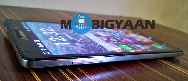
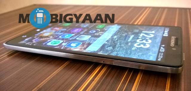
The power button is located on top of the device which is the only qualm we have with the design. It is not easy to reach and also not easy to press but thankfully Lenovo has incorporated the ability to double up the volume rocker as the wake button. There’s also the 3.5 mm jack on the top.
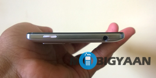
The bottom of the devices houses the micro USB slot. There’s a metal rim that runs through the sides of the device, which makes it look even better.
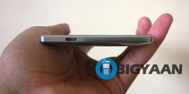
All in all, the Lenovo Vibe Z is designed how a premium smartphone should be. I have had many friends wanting to buy the smartphone after having a look at it. You’ll be pretty proud in taking out the Lenovo Vibe Z in public.
Display
Lenovo Vibe Z comes with an IPS display measuring 5.5-inches of Full HD (1920×1080) resolution. The pixel density comes in at 401 ppi which is pretty great. The display features Corning Gorilla Glass 3 for added protection.
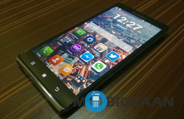
The display is sharp as expected and you cannot tell any individual pixels apart. The display is quite vibrant with good contrast and saturation. The whites looks a bit greyish while blacks are pretty good for an IPS display but not as black as AMOLED displays. The brightness is great as we have come to expect from IPS displays.
The display impressed us, when it comes to viewing angles. Lenovo also lets you adjust the saturation, hue and sharpness.
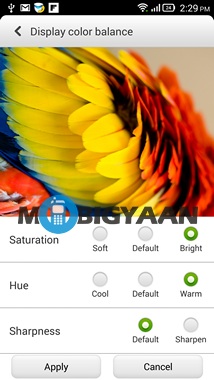
Even though the brightness is great, the display was an average performer in bright sunlight. We also found the Automatic Brightness adjuster to be on a little slower side. But all in all, the display is truly brilliant with nothing really going against it.
User Interface
Lenovo Vibe Z comes with Android 4.3 Jelly Bean but the interface is heavily customised. If you love fiddling around with options then the Lenovo Vibe Z is for you. There are plethora of options for almost everything. There a lot of things to talk about, so get your popcorn and be patient, that’s what we suggest.
There’s no app drawer, yes, you heard that right. Instead, Lenovo takes some cues from iOS. All the apps are on the homescreen itself along with the widgets you want to have. Since the homescreen is the app drawer itself, you can have upto 18 homescreens. While the stock Android is more flat, Lenovo uses more colors and glossy icons.
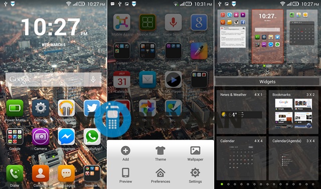
Lenovo has gone ahead and changed everything from stock Android, everything looks drastically different and sometimes cool too (for example, the Gallery app). There is a theme suite which features 8 different themes. Every theme brings its own set of icon design and different system UI, notification UI and also different boot animations.
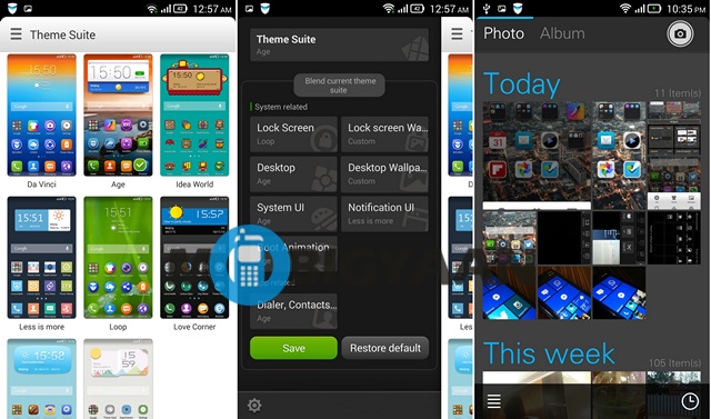
You can go ahead and change almost anything when it comes to looks and even animations. You can change the scrolling and transition effects on the homescreens. There are also gestures which are easy to use and also quite handy.
There a lot of cool software tricks, Lenovo brings with its interface. There’s Pocket Mode which when turned on automatically increases the phone volume when the phone is inside the pocket. Shake to lock which lets you lock the screen by shaking the device, Smart Standby lights up the screen when it knows you are looking at the display. Smart Sleep locks the screen when the device is placed horizontally. There’s a cool Wide touch feature which brings a button on the screen for one-touch shortcut access. A couple of features are straight from Samsung’s book, Smart Answer which lets you answer calls by just bringing the phone to your ear and Smart Call lets you call a number when you are into a contacts profile or message conversation by just bringing the phone to your ear.
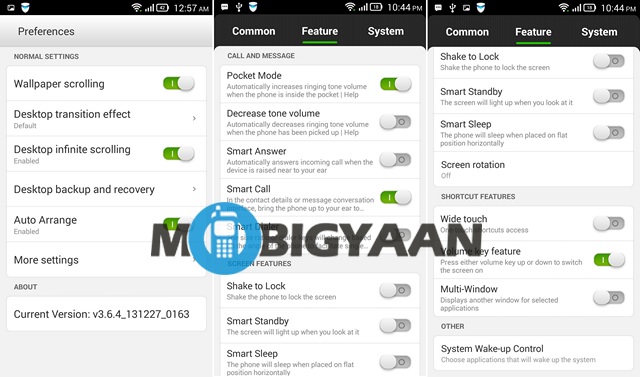
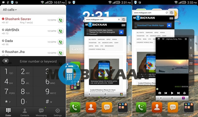
Keeping in mind that the Lenovo Vibe Z is a phablet, Lenovo has brought about a few handy features for better usage of the screen estate. Smart Dialer inclines the dialer on the side the phone is tilted. There’s also a Multi-Window feature which works quite well. It brings a small pop up of the app and you can increase the size of the app, move it around and close the app though small buttons. You can have maximum two apps run side by side. The feature supports many of the popular apps and not just basic apps. Chrome, WhatsApp, Instagram, YouTube, Flipboard and many other popular apps are supported so it is quite a handy feature.
You can also choose which apps have the ability to wake up the system. You can also prioritize notification from apps. You can choose to get notifications from certain apps only on a WiFi connection.
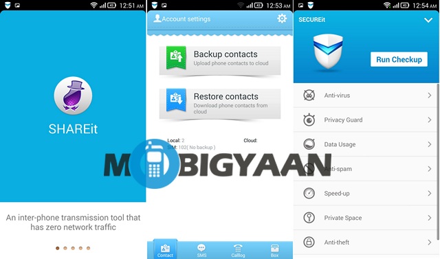
Lenovo has pre-loaded a number of useful apps along with Google apps. There are Lenovo apps SHAREit, SYNCit and SECUREit. SHAREit lets you share files, apps, contacts, music, videos over Bluetooth or on the same WiFi connection and thankfully, the app is available on the Google Play Store so that people with devices from other companies also use it. You can also share over a group of people on the same WiFi connection. SYNCit is quite a handy feature and it lets you backup contacts, SMS and call logs as well. The last but not the least, SECUREit is as its name suggests a security app which also blocks malwares, viruses, spam and also lets you speed up your device by clearing the RAM and stuff. There’s also an Anti-theft feature. All in all, we are glad these apps work quite well.
There are other handy apps such pre-loaded like Facebook, Twitter, Evernote, CamScanner, CamCard, Driving apps, Mobile Assistant, Kingsoft Office, AccuWeather, Navigate 6 and some games like Asphalt 7, Real Football 2014, Green Farm 3.
There are the features you would expect from Android 4.3 Jelly Bean. All the Google apps are already pre-installed on the device. The music on the device is handled by Google Play Music and there’s a Video app, the Vibe Z comes with and it is very basic with not all formats supported and not much controls but as with Android, you can always get a great third party client.
While most of the changes from Lenovo are okay and sometimes good as well but there was one thing in the interface which was most irritating. The menu button doubles up as the multitasking button which sometimes does not work too well. The multitasking interface is a straight lift up from iOS 6. Why has Lenovo done that is seriously surprising when they could have just gone ahead and used stock Android’s multitasking interface. When you long press the menu button, the multitasking interface pops up but the problem is, when you are in an app and you press hold the menu button, the menu in the app appears first then comes the multitasking pop-up.
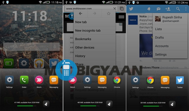
So, how do we like the user interface on the Vibe Z? Well, that’s a tough question and it depends on the type of user you are. If you are someone who loves plethora of customization options and features, then you are going to love Lenovo’s interface while if you are more of a fan of stock Android then you won’t like it that much. At first, Lenovo’s Android interface is a bit of a learning curve but when you get used to it, it can be quite good but for me the multitasking interface was the most sour thing of all.
Performance
The Lenovo Vibe Z looks like a flagship device, we already talked about that but it is no slouch when it comes to internals as well. The Vibe Z features the industry beloved Qualcomm Snapdragon 800 chipset with four Krait 400 cores clocked at 2.2GHz. There’s 2 gigs of RAM for your multitasking needs. And all that firepowerpower works as we would have expected, flawlessly!
We have been using the device for a few days now and we have not have had a single hint of lag on the device. The device does not gets bogged down ever. There’s nothing negative to talk about here, how bad! Well, jokes apart, apps launch fast, switching between apps is quick. Everything works great, there are no app crashes or reboots of any kind.
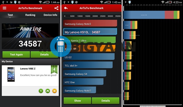
We all know what a beast the Snapdragon 800 is and the benchmarks reaffirm that. Check out the some of the benchmarks we tested below:
Talking about the ‘phone’ in the smartphone, we had no problems in network or in call quality, the noise cancellation works as it’s supposed to. But since the device is a bit on the huge side, not holding it properly to the ear results in low sounds. The speaker on the rear of the device is pretty good with loud and clear sounds.
Battery Performance
Lenovo Vibe Z comes with a 3000 mAh battery which is non-removable, thanks to beautiful unibody design. Lenovo has pre-loaded a Power Manager app which brings a number of modes for your usage style. There’s Alarm mode, Long Standby, Normal mode and a Custom mode. There’s also an Ultimate Saving Mode which disconnects all connection. There are also some cool tricks in the software to increase the battery performance like Smart settings which automatically powers off WiFi, Bluetooth, location and others when not in use. There’s also Screen saving which Lenovo says is a unique screen adjusting tech which reduces 20% battery consumption. Smart Endurance is another battery saving feature which . You can also freeze apps in the App Freeze Center to save power.
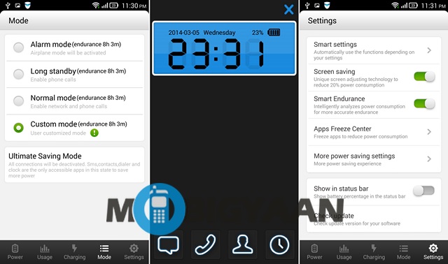
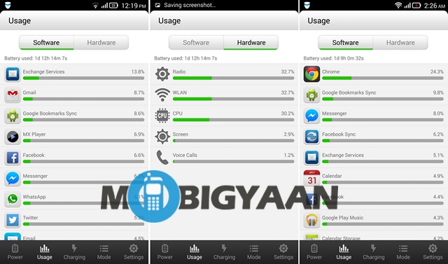
In our use case, the battery life was pretty good and we got more than day of usage after some moderate to heavy usage. We tested the device many times after charging it fully and we got an average of 1 day 8 hours of usage. We used the device in Normal mode so you should get more out of the battery, thanks to some great battery saving features the Power Manager app brings.
Camera
The Vibe Z comes with a 13MP rear camera with LED flash of f1.8 aperture which suggests better low light pictures. We can make out that Lenovo has been quite serious about their camera performance. So, let’s check out if the camera is a great performer or not?
Talking about the camera interface first. As with the other features in the OS, even the camera interface is filled with a lot of options to play with. The right pane of the camera viewfinder consists of the capture button along with a button to change from Still mode to Video mode, there’s also the last captured picture.
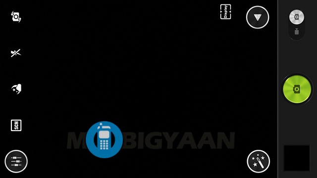
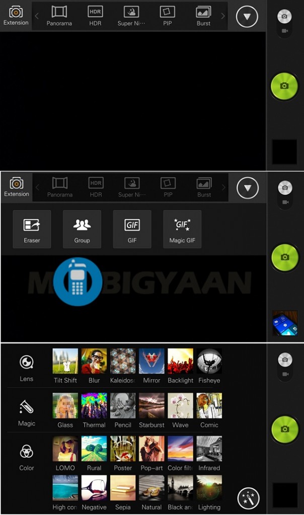
On the top, you have a drop down menu button which brings modes such as Panorama, HDR, Burst, Smile, Macro among others. In the drop down menu, you’ll find an extension button, which hides cool camera modes such as Eraser, Group, GIF and Magic GIF.
On the left pane, we have four shortcuts to your favorite settings. While the first button for changing from rear to the front facing camera is fixed, you can change the other three in to your favorite setting, which you use regularly.
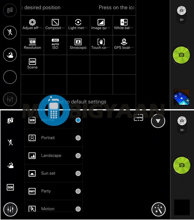
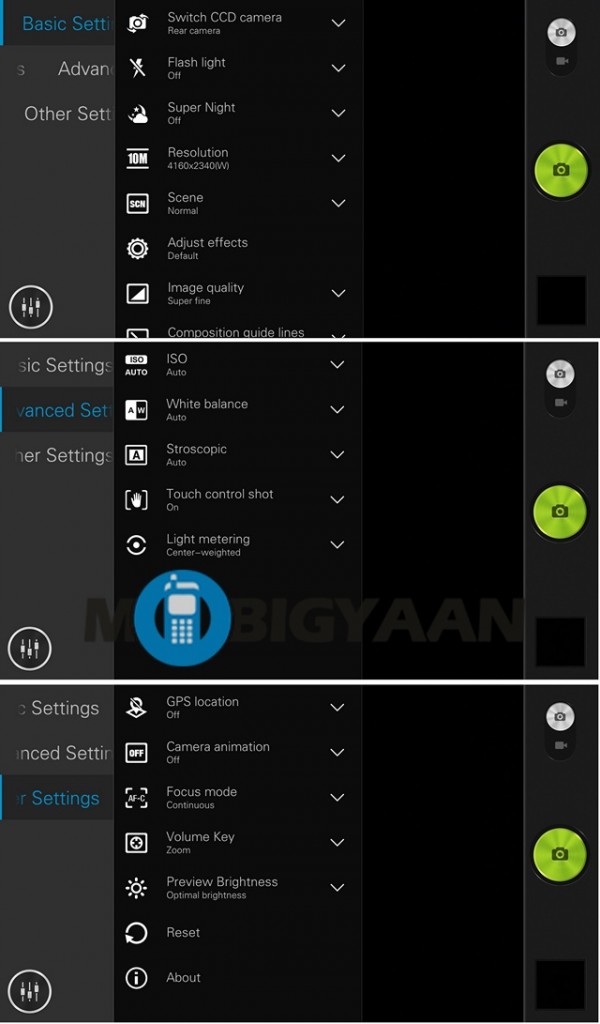
In the settings on the left pane, you’ll find all the options available, with settings grouped into Basic, Advanced and Other. All in all, the camera interface is pretty nice and it surely makes the shooting experience a whole lot better. There are a number of features you can play with and it surely adds to an interesting experience on the whole.
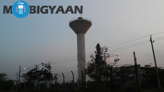
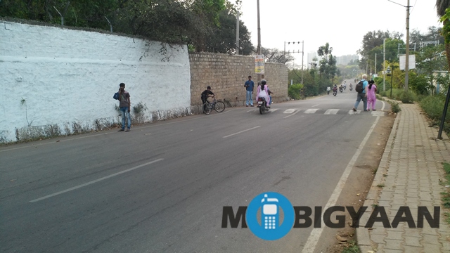
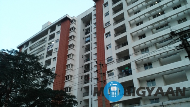
Coming to the quality of the pictures, the Lenovo Vibe Z is no slouch. The daytime shots and pictures taken in well lit conditions are excellent with good amount of detail, good color accuracy and sharpness. Check out some of the samples below:

Lenovo has also worked on improving low light snaps and well, they have done a commendable job. The pictures taken in low light are good but sometimes, we find a bit of noise creeping in. The pictures are quite sharp, which on the other hand results in a bit of noise. The dual-LED flash is quite handy in overtly dark conditions and it works quite well. Though, the camera does not come close to Nokia’s low light abilities but it still does well when considered the competition.
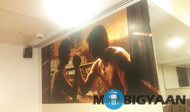
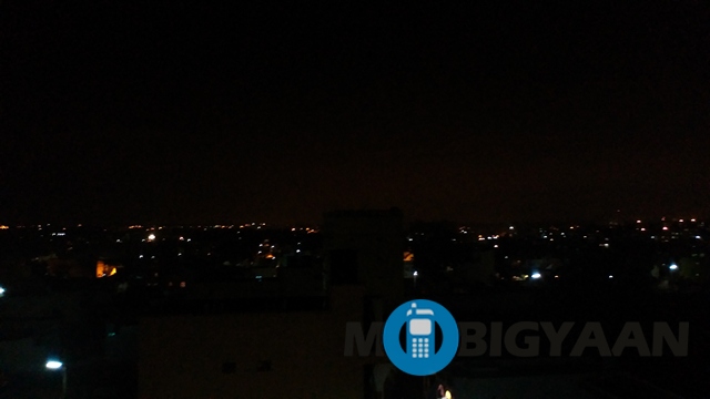

The videos taken with the device are good with good detail, natural colors and sharpness but we surely miss Optical Image Stabilization. The front facing camera is a wide angle one, which means you can take better selfies and fit in more people. Yes, this device will surely mean you can capture better quality selfies.
All in all, we are quite pleased with the camera. The only problem we faced was that the camera can be sometimes a bit slow to focus. We are sure Lenovo can fix that up in an update. Well, having extensively used the device and the camera, we can tell you that there’s no way you will regret the camera on this device. It works great.
Connectivity
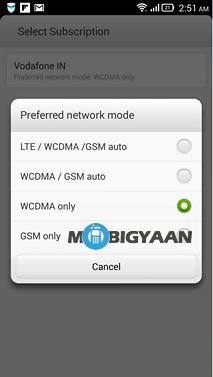
The Lenovo Vibe Z we received is 4G LTE capable but it does not support the 4G LTE bands in India, which is a shame. The connectivity is well covered like any other high-end smartphone. There’s 3G connectivity, Bluetooth 4.0 with A2DP, Wi-Fi 802.11 a/b/g/n/ac, dual band, USB on-the-go support and microUSB 2.0. There’s the usual sensors like Accelerometer, proximity and compass.
Conclusion
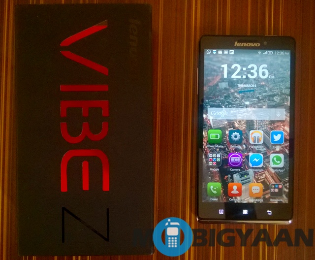
The Lenovo Vibe Z just yesterday went on pre-order and is priced at Rs. 34,999 which is less than what we heard at launch. Considering the competition at the price range, we would surely recommend the Vibe Z to anyone. The premium design, brilliant display, smooth experience, satisfactory battery life and a great camera make the device truly an attractive beast. The number of pros surely outweigh the negatives such as the poor lock button and only 16GB storage with no microSD expansion.
If you don’t care about the storage much, then there’s no reason you shouldn’t buy the Lenovo Vibe Z.
Pros
- Beautiful design
- Smooth and feature rich software
- Great camera
- Good battery performance
Cons
- No expandable storage
- Placement of the lock button

![Win Gionee Elife E7 [Giveaway] 34 Gionee Elife E7](https://www.mobigyaan.com/wp-content/uploads/2013/12/Gionee-Elife-E7.jpg)