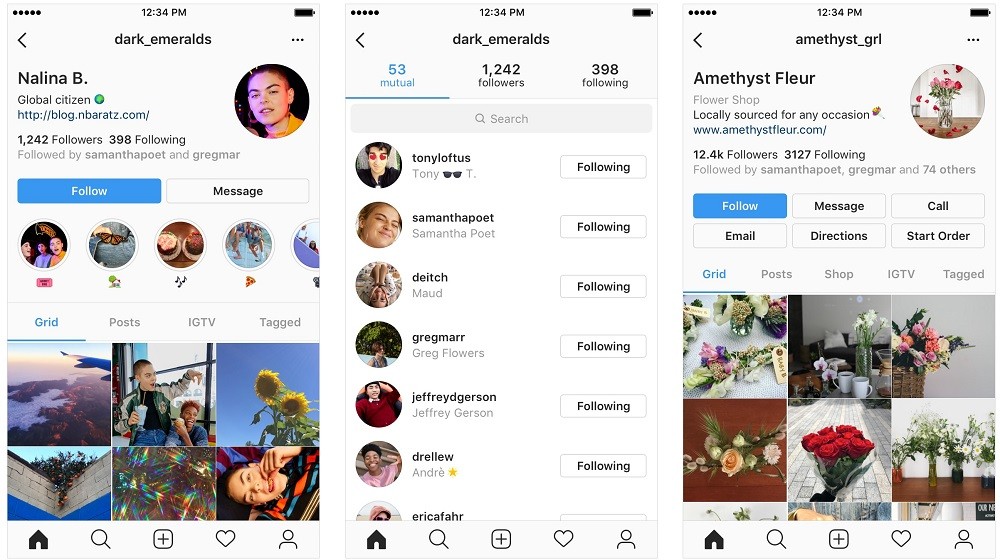
Last month, Facebook-owned Instagram announced that it will be bringing some design changes to the profile page. However, it looks like the company might change the overall UI of the app as it has started testing a new UI for its Android and iOS apps.

According to a report by WABetaInfo, Instagram has started testing a card-based UI for its Android and iOS apps. With this new UI, users will be able to check out posts in their Feed by swiping through them – like Stories – instead of scrolling up and down. And, when you are checking out the posts, there will be a small thumbnail preview above those posts.
Besides, when you are swiping through the posts, the Like, DM and Bookmark buttons will appear right next to the text box for comments, instead of above the caption.

Having said that, this new UI will also come with Profile and Direct tabs inverted. What that means is that the positions of the Profile and Direct icons will be swapped. The Profile icon will appear right next to the IGTV icon at the top, whereas the Direct icon will appear on the menu strip at the bottom.
You can click here to see the new card-based UI in action.
There’s no word on if and when this new card-based UI will be rolled out to the users, but, we believe that this new UI will be rolled out together with the new profile page.
Also Read: How to check the amount of time you spend on Instagram [Android Guide]
We personally don’t like this card-based UI and would like to stick to the current one. However, we will reserve our judgement until the final design changes are rolled out by Instagram to all the users.
What are your thoughts on this new card-based UI? Do you like it?
