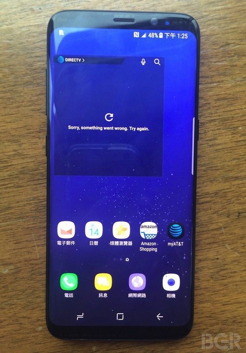
Thanks to the numerous leaks of the renders and images that have been surfacing online for quite some time now, we have a pretty fair idea of what to expect from the Samsung Galaxy S8. We already know how this upcoming Samsung flagship will look and what kind of hardware it would pack, however, thanks to a recent leak, we now know how the UI on the Galaxy S8 might look like.

Screenshots of the Samsung Galaxy S8 launcher and app icons have been leaked online which give us a look at the Galaxy S8’s UI. These were discovered in an apk file of the latest version of Samsung’s Smart Switch app. Going by these images, we can say that Samsung has taken a minimalist approach towards the UI. You can also see the on-screen navigation buttons which have made appearance in the past leaks quite a few times now.
Also, one image shows the UI with app drawer whereas the other has it missing. Well, it’s quite possible that Samsung would let its users choose whether they want an app drawer or not, by making it possible to enable or disable it from the Settings menu. Apart from this, you can also see the Samsung app icons with new design. The icons now just have an outline of phone and camera along with broken lines.
Having said that, this UI seems to be still in development as you can notice that the apps don’t have names below their icons. It’s also quite possible that we might see a different look on the Galaxy S8 when it’s launched. After all, nothing’s ever finalized and confirmed until and unless it has been made official by the company itself.
Samsung Galaxy S8 and Galaxy S8+ rumored specifications:
[table id=90 /]
The Samsung Galaxy S8 is going to be unveiled on March 29 so expect more stuff like this doing rounds on the Internet. By the way, did you like this new UI?


