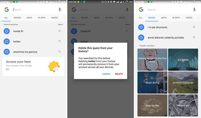
Whenever we want to search for something using our Android device, we search for it by either using the Google search bar present on the homescreen or by saying “Ok Google”, even when we do have the standalone Google search app installed. The reason? Maybe it’s just easier, or, we find the UI of the search app boring. Well, if you are the second type of person, you will be glad to know that Google is testing its search app with a new interface.

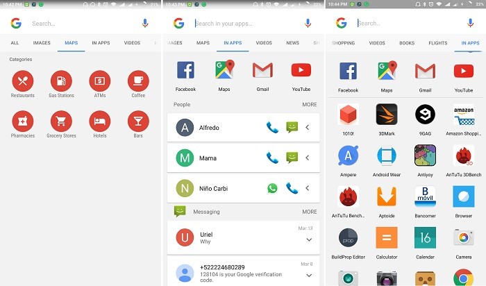
With the new user interface, all the recent searches are separated across different categories like All, Images, Maps, In Apps, Videos, News and more. Even the Image search section now shows popular searches.

Also, as you can see, the In Apps section looks like an App Drawer now which lists all the apps that are installed on your Android device. As of now, this change is appearing on the Beta version of Google Search app with version 6.14.17.21. If you like this new interface, you can download the apk from here, however, there’s no guarantee that you will get this new interface on your Android device.
At this moment, it looks like a server side switch from Google’s end, hence, you will only see this new interface on the Google search app if Google flips a switch from their end for your device. Having said that, if you come across this new UI on Google Search on your device, do let us know if you notice anything different.
