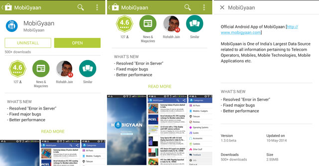
This year the focus of the annual Google I/O conference was on design. As such Google revealed the new Material Design concepts which would be used on the Android platform. Now the company has used it in the refreshed Google Play store.

Google has released an update to the Google Play store. While at first we thought it was just a regular update, we were pleasantly surprised to see the revamped Material Design UI for the listing inside. The app listings and other content pages within the app have received new smooth animations along with cover photos and videos which are displayed right on top.
The updated Google Play store focusses on the content which is perceived useful to the user. As such, app descriptions and change logs are available in full screen mode. However, change log of the app is available only to users who have the app installed. The sharing buttons have been moved to the bottom. Google has already started pushing the updates to the devices but if you can’t wait to get your hands on the revamped UI, hit the source link for the original APK.

