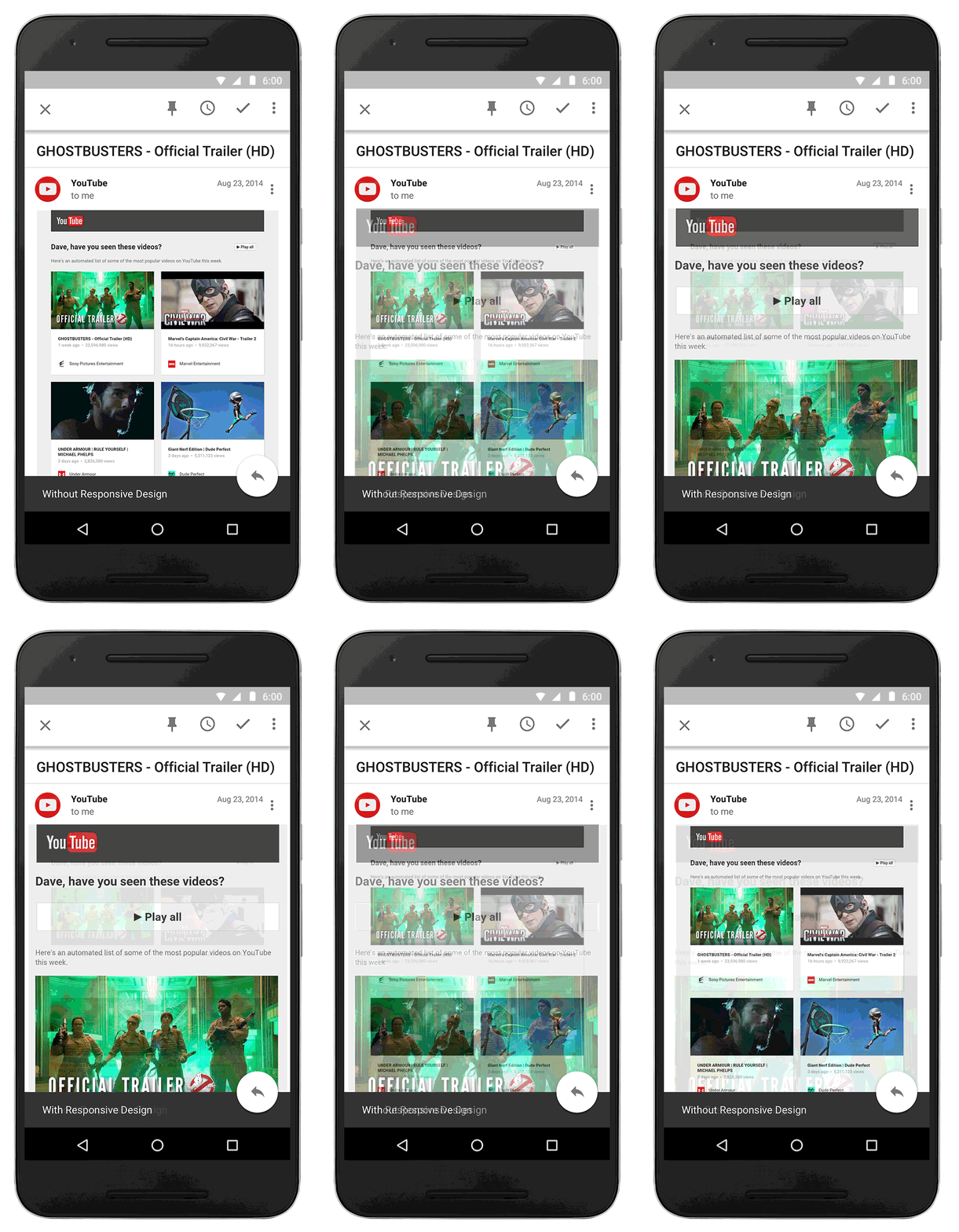
Smartphones have made it easier for us to access content which otherwise would require a desktop/laptop computer. We can watch videos, play games, make video calls and read emails. Talking about emails, while we can read an email on a smartphone, the experience is often not similar to the one we are used to on a computer.

Emails are often rendered improperly on smartphones which makes it difficult for us to read them. The text is often small and the links and buttons not visible. We have to zoom in the email to be able to read the text or click on the links or buttons that are present in it.
Well, this will soon be a thing of past as Gmail and Inbox by Gmail will soon get support for emails with responsive design. Wondering what responsive design is? Well, content created with responsive design adjusts itself according to the size of the screen. Hence, emails will be a lot easier to read on smaller screens now. These changes will reflect on the web version of Gmail as well because the emails designed for mobiles can adapt to the larger screens.
Email designers will be able to make use of CSS media queries to make their emails responsive making it easier for the readers to view them across different screen sizes.
“When you send emails, your recipients might read them on a computer, tablet, or phone—or more likely, all three. However your message might look different on all these devices. Later this month, you’ll be able to use CSS media queries with Gmail and Inbox by Gmail to ensure that your message is formatted the way you intended, whether it’s viewed on a computer, a phone in portrait mode, or a tablet in landscape mode. You’ll be able to change styles based on width, rotation, and resolution, allowing for more responsive formatting to optimize your email for every device.” said Google in a blog post.
The update will be rolled out later this month and we look forward to it.

