Gionee has been having a great year. Besides gathering rave reviews for its Elife series, the company has come out with the world’s thinnest phone – the Gionee Elife S5.5. The company has broken our perception of Chinese companies and actually come with phones that give awesome features at an awesome price tag.
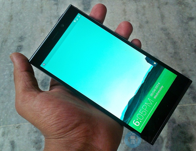
The Gionee Elife E7 was launched in India in December last year at a price of Rs. 29,999 (MRP) for the 32 GB model. It currently retails at Rs. 27,000 for the 32 GB model and Rs. 24,000 for the 16 GB model.
Gionee Elife E7 specs :
- 5.5 inch display
- 1920 x 1080 pixels resolution
- 2.2 GHz quad core Qualcomm Snapdragon 800 processor
- 2/3 GB RAM
- 16/32 GB internal memory
- 16 MP primary camera
- 8 MP front facing camera
- Google Android v4.2 Jelly Bean
- 2500 mAh battery
The Gionee Elife E7 builds on the success of its predecessors, the Elife E6 and Elife E5 smartphones. It’s foremost achievement is touted as its 16-megapixel cam, but there is actually a lot more on offer. For starters, Gionee has completely revamped the form factor and also tweaked the software, a lot.
At around Rs. 24,000, you might call the Gionee Elife E7 a mid-range smartphone, but in fact, it has all the features of a high-end phone – whether it be a full HD display, a Snapdragon 800 processor or even an awesome camera. This kind of pricing is rarely seen in the smartphone market, but I suspect this can be only due to one reason, either Gionee is backed by a company that manufactures parts for smartphones or it wants to create its own market share in the increasingly competitive market. Both ways, I love it!
I am pretty excited to get my hands on and review this phone. So, without further ado, here is the Gionee Elife E7 review.
Hardware
Despite its monstrous 5.5-inch display, the Gionee Elife E7 is endowed with a suave form factor. The handset is easy to hold, compared to most handsets of the same size. It has a glossy plastic form factor, yet doesn’t feel cheap at all. The curve of this handset is just about right and you can actually feel its smooth lines as you hold it.
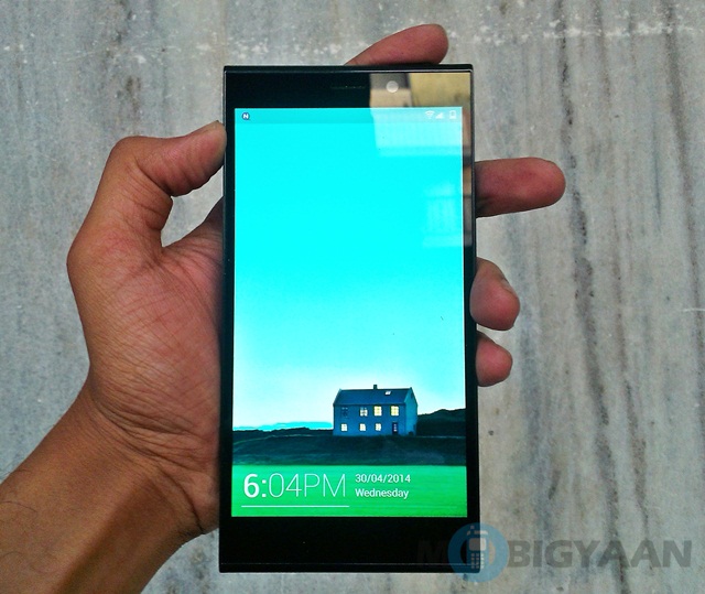
One look at the handset’s behind will showcase how big it is. But Gionee’s achievement is that the handset is big, yet not bulky.
The front is mostly covered by the 5.5-inch display, and the bezels are just about right.
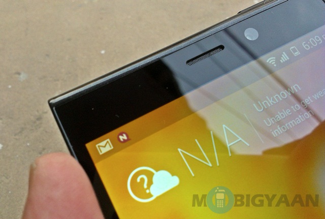
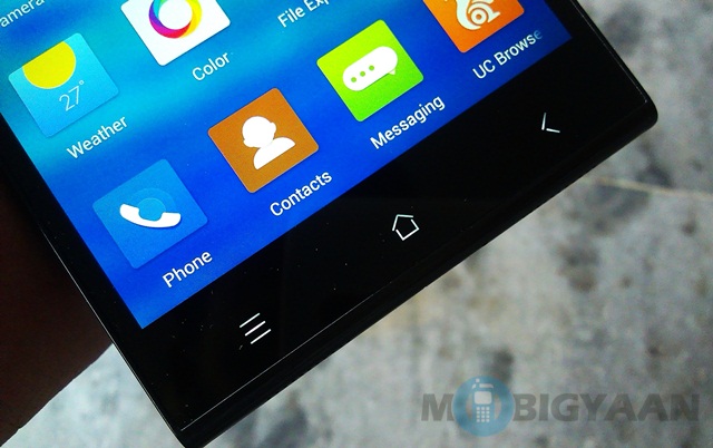
While the bottom bezel is covered by capacitive buttons that light upon your touch, the top is covered by a speaker and a front cam.
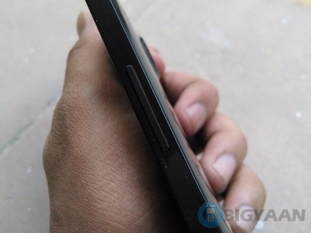
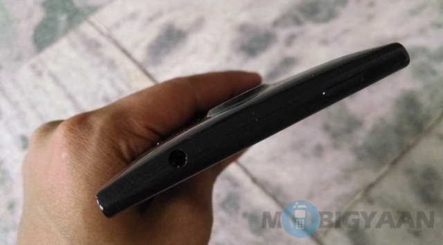
The physical buttons too are easily placed within reach, despite the huge slugger this smartphone is. The power button is placed on the top, while the volume rocker is located on the right side of the handset.

The bottom of the handset houses a MicroUSB slot, while the top houses a 3.5mm audio jack.
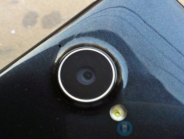
The back of the handset is mostly plain, except for the camera which has the biggest lens I have seen on a smartphone ever.
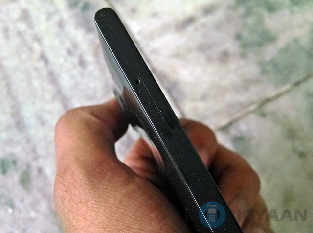
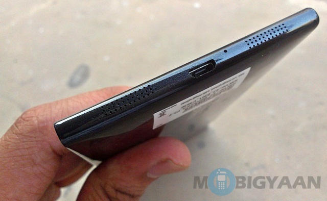
The Speaker is located at the bottom and lends some style to the Gionee Elife E7. The handset is a unibody one and there is slide-out MicroSIM tray, which has become quite popular of late.
The back gets a little smudgy and the handset might get a tad scratchy, but Gionee has already provided you an awesome military type leather flip cover too prevent that, which I found pretty cool.
The Gionee Elife E7 is definitely a vision in black. It looks cool and Gionee has achieved something even high-end companies fail at – a great size to user-friendliness ratio. Its huge size, though makes handsets such as the Moto X look like little weasels.
The way this handset has been put together is nothing short of impressive. I have totally been swayed by its charm in the hardware department.
Display
The one thing that I am very fond of Gionee for, is its displays. The Elife series has actually changed the whole game by bringing out amazing displays, even in mid-range handsets. Before Gionee came on the scene, full HD handsets remained mostly out of the reach of the mid-range consumer. Ever since they have been out and about, we have had amazing smartphone experiences even on tight budgets. This is one company that knows how to get their displays right and for a person like me, having a good display matters even more than having a great camera on-board, just because that is the actual part of the smartphone you will be using the most. It is your all-access pass to the rest of the smartphone.
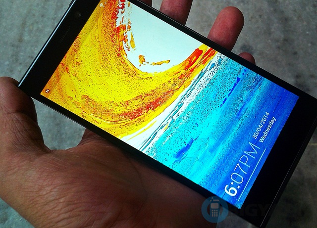
Gionee, has yet again delivered with a superb display on the Gionee Elife E7, although there is a small difference compared to previous iterations. Surprisingly, Gionee has downgraded the pixel density on the Elife E7, instead of the usual 441ppi, this one comes with 401ppi, possibly since there is a 5.5-inch display on this one. Well, I can’t say that I actually missed something, despite this change.
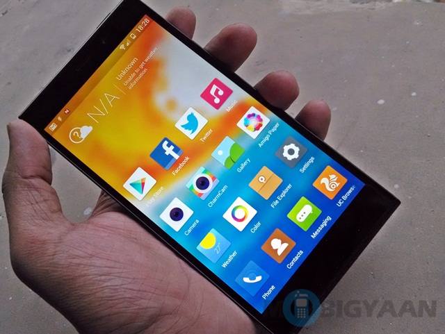
The display was awesome and whether I used it with high or low brightness, it responded amazingly well. The screen lights up well, has great viewing angles and great color saturation. It is smooth to touch and use and pretty responsive. The sunlight visibility is equally good and I had no complaints.
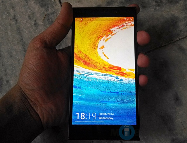
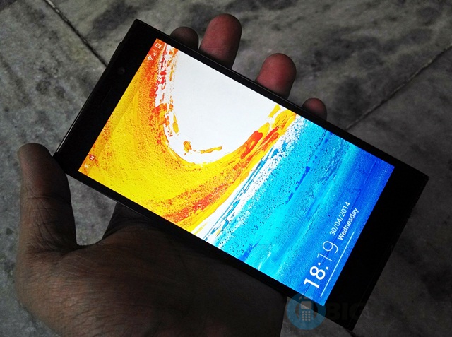
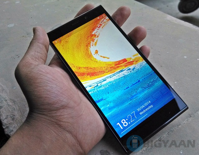
The display is well optimized and you won’t have any troubles viewing high-def content on it. If anything I would rather prefer viewing such content on it. As far as the display goes, Gionee has totally delivered on this one and I can say with conviction that the Gionee Elife E7 might have the best display among similarly priced handsets.
Software
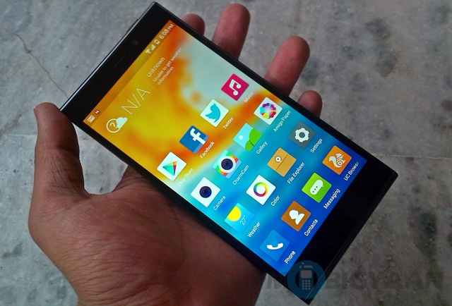
Gionee has debunked the usual Android interface and instead gone for its own highly customized UI. In the past, whenever I have seen this, it has turned out to be a failure. Still, Gionee has debunked the usual Android app drawer and gone for a heavily customized. It is surprisingly good!
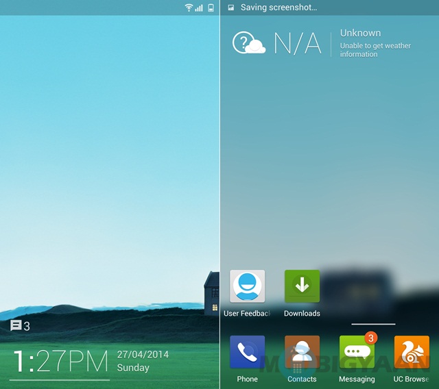
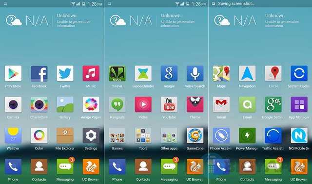

First up, I have to put in a word for the app interface. What Gionee has done is this. It has endowed the handset with an animation – what happens with this is that the homescreen wallpaper fades into the the background when you access the apps and now you have apps in the forefront and a faded wallpaper in the back. This creates a beautiful incandescent effect that is a pleasure to look at.
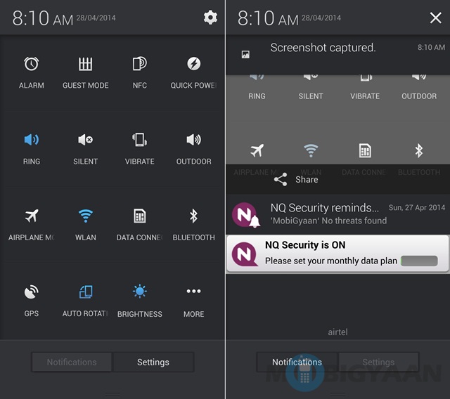
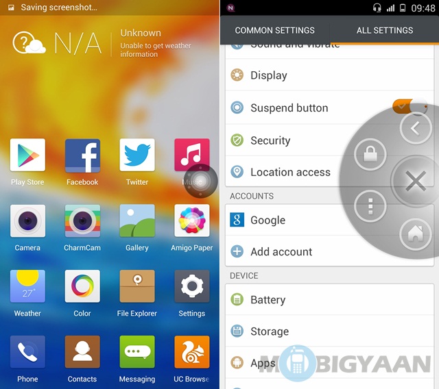
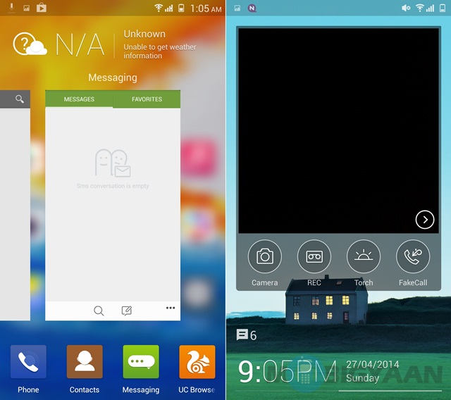
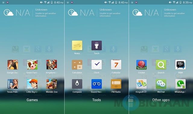
The one thing that actually creates grounds for complaints when a company gives up on the Android app drawer that in case you use too many apps, the screen looks clogged and isn’t easy to use. Gionee has treated this ailment with folders in place, which comprise of apps under a single domain such as ‘games’ or ‘tools’.
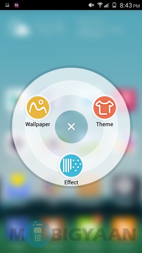
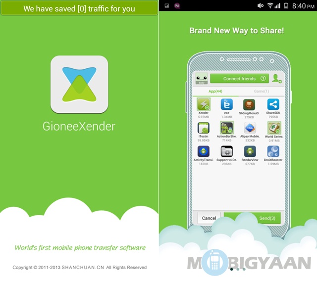

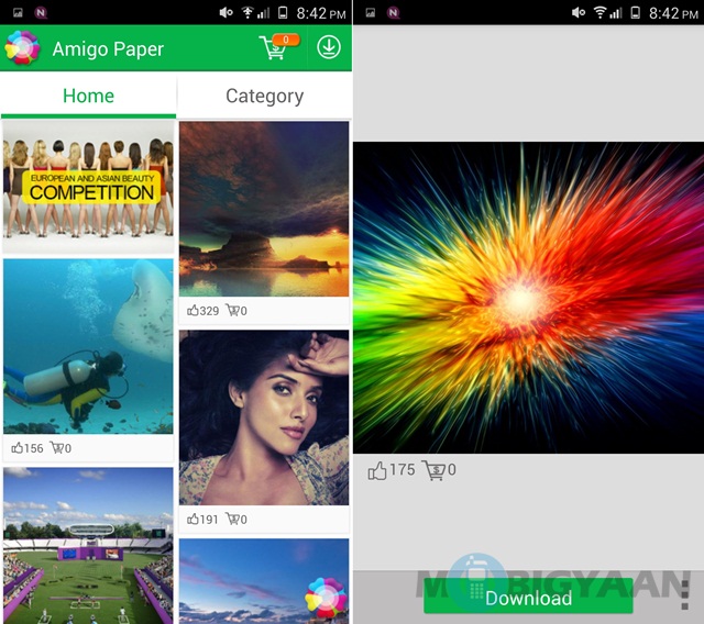

Switching between apps is smooth as silk and accessing necessary shortcuts such as settings is pretty easy. Not just that, the company has added new and cool apps such as Charmcam and Amigo Paper.
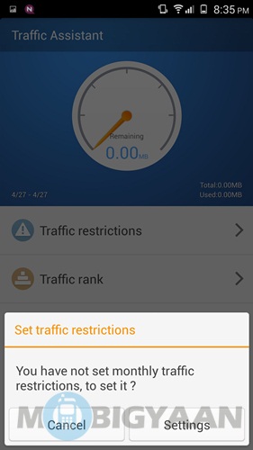
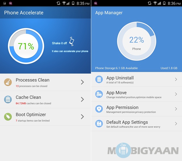
Gionee has even endowed the phone with stuff such as power manager, phone accelerator and traffic assistant. An app manager is also in place to let you easily install and uninstall apps.
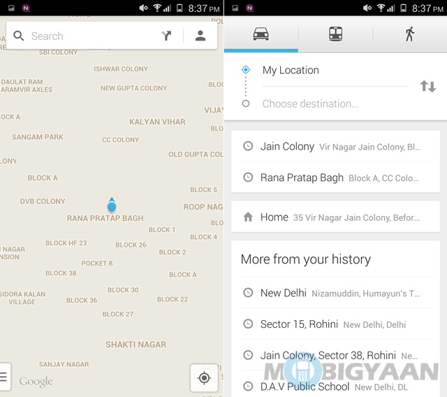
Google shortcuts such as Gmail, Google Maps and Hangouts are also pre-installed on the phone.
There were no lags or other problems with the software.
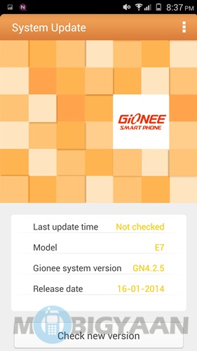
I have to say I am more than impressed with Gionee execution, yet again. I just hope that it gets an Android update, since it works on Android 4.2.
Camera
The 16-megapixel camera at the back of the Gionee Elife E7 is touted as the USP of this handset. Is it worth it? Yes, totally.

I generally don’t go for marketing gimmicks, but I have to say it has the biggest lens on a smartphone camera that I have ever seen. It looks quite suave and accompanied by the LED flash, and it is the highlight of the back.
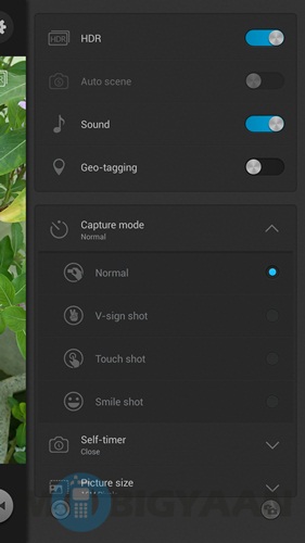
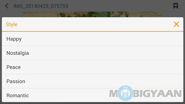
The camera UI is pretty cool and lets you choose from a variety of modes.
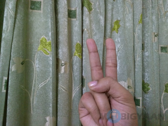
Not just that, there also certain ‘capture modes’ available, the most interesting one of which I find V-sign shot.

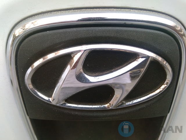


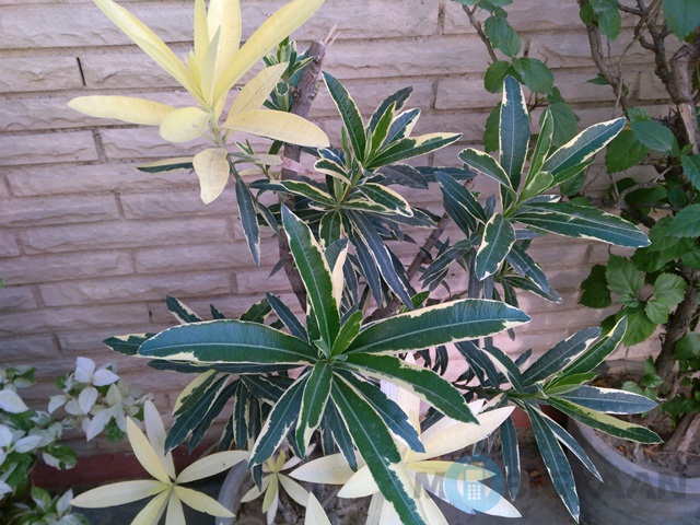

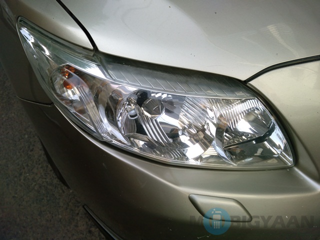


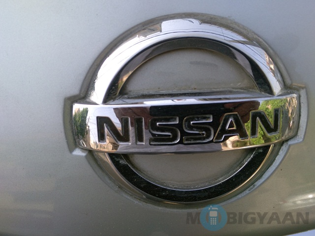
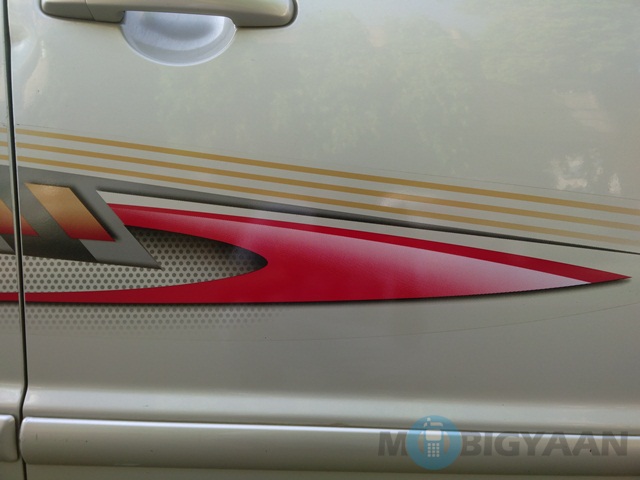


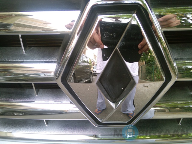


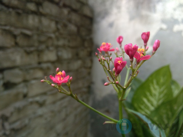
Besides this I took many shots from the camera and all of them came out good. The level of detailing on this camera is pretty awesome and color capture is pretty great.
Given its price tag, this camera is what makes the Gionee Elife E7 a steal for its price tag.
Performance and Battery Life
This is another hidden talent of the Gionee Elife E7 – this mid-range slugger comes with Snapdragon 800 processor under the hood!
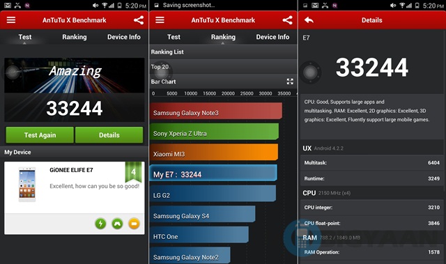
Move over cheap MediaTek processors and other processors, this one actually has a lot on offer!
As always, the Snapdragon 800 does not disappoint. As far as the benchmarks go, it ranks pretty good, as you might notice, most of the handsets pegged near it are almost double its price tag – a fact that speaks volumes by itself.
Whatever you want to do with the device, it is up for it. The Gionee Elife E7 surprised me with its elegance. I could easily play high-intensity games without any lags. Switching between apps in easy and everything pre-installed on the phone works like a charm.
As far as the connectivity goes, here too, there were no issues at all.
How about battery life then? Since it is such a huge slugger with so many features, the battery life must go up for a toss, right? Nope. Yet again the Gionee Elife E7 shines through, even where you don’t expect it to. The 2500 mAh battery is more than adequate to push through the whole day easily. The phone is optimized greatly, which is why the battery is such a success.
Verdict
The Gionee Elife E7 breaks every myth about a phone from a Chinese company. It is mostly flawless! I tip my hat to Gionee for endowing the phone with awesome stuff such as a 16-megapixel camera, a full HD display and a Snapdragon processor in such an affordable price tag.
The design is premium, the processor works great and there is absolutely no room to complain on this one. Gionee has definitely created a phone that gives an all round performance. The only qualm I might have is Android 4.2 on board, which I really hope the company issues an Android update in the near future for. Otherwise, it is a pleasing beauty.
For its price tag, I would say that the Gionee Elife E7 is an absolute paisa vasool phone. The competition fades away in comparison, whether it be the Micromax Canvas Knight or other similarly priced handsets.
I am definitely beyond impressed by Gionee. It just seems like it is getting better with every new iteration of its smartphones. It is one company that delivers high-end performance in a mid-range price tag, every time. If you are in the market for a good phone, try this one out and then try some ‘high brands’ such as Samsung, HTC and Apple. I think you will come back to this one for a second look.

