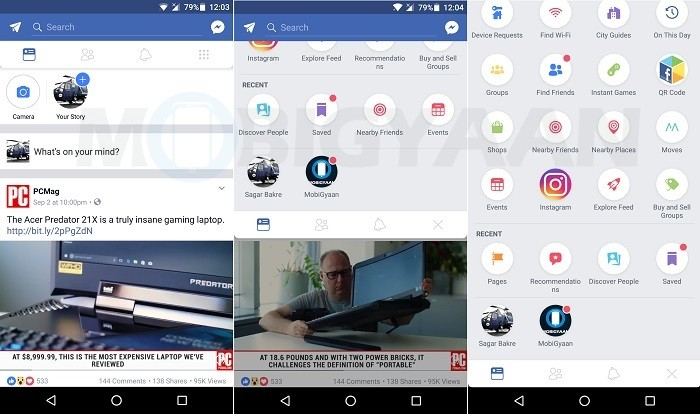
Social media giant Facebook, like Google, is known to test different features and UI on its apps before rolling it out widely to all its users. Earlier last month, we saw Facebook testing Stories on its desktop website. Now, the company is testing a new pull-down menu on its Android app.
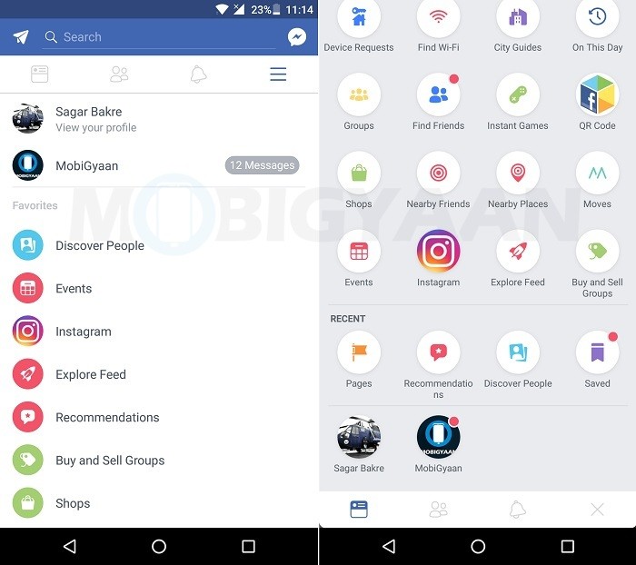
Facebook has started testing a new pull-down menu along with in-app notification dots on its Android app. Instead of the three horizontal lines (also called hamburger menu icon), a new nine dot grid icon appears at the right side of the notification bell icon.

As soon as you as tap on the new icon, the menu slides down from the top instead of from the left. As you pull it down further, you can access all the settings options along with shortcuts to the Facebook pages that you admin.

Moreover, like we said, Facebook is also showing notification dots on various icons where you have unchecked notifications. For example, we had around 10-12 unread messages on our Facebook page, hence, instead of showing the number of unread messages, we got to see notification dots.
Furthermore, the top bar which accommodates the News Feed, Friend Requests and Notifications option is also slightly curved along the bottom edges now.
However, having said that, it’s safe to say that this is a server-side switch and only a small number of Facebook users would see it. We could only see it on our OnePlus 3 for a short period of time. When we updated the Facebook app to the same version (which is 139.0.0.26.93) on our LG Q6 and OnePlus 5, we didn’t find it.
Also, it’s needless to say that just because Facebook is testing this new pull-down menu doesn’t mean that the company will actually roll it out to all the users in the future. Their plans can always change.
By the way, what do you think about this new pull-down menu with notification dots?

