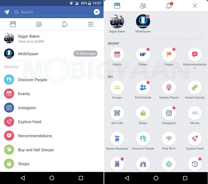
Around two weeks ago, we told you that Facebook was testing some UI changes in its Android app which included a new pull-down navigation drawer as well as notification dots like the ones we have seen in Android Oreo. Well, it seems Facebook didn’t like that pull-down gesture as the company is now testing a swipe-up gesture to open the navigation drawer.

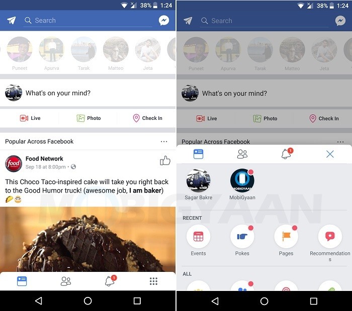
Facebook hasn’t made any changes to the way the new navigation drawer is accessed, but it has changed the position of the navigation bar from top to bottom. Hence, in order to access the new navigation drawer, you either perform a swipe-up gesture on the navigation bar, or, tap on the grid icon that has replaced the traditional hamburger icon.

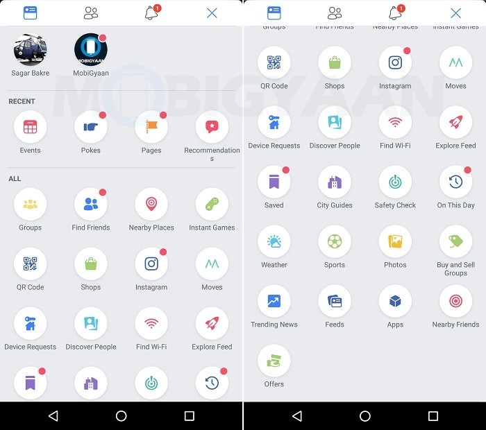
One tap on the grid icon will open the navigation drawer half way. To open it entirely, you will have to drag it off till the top of the screen. After that, you can simply scroll through the drawer to find the option you are looking for. The notification dots that we talked about last time are present as well.

However, unlike last time, we couldn’t record a video to show how it actually works, because within a minute of checking out this new navigation drawer, the app crashed, and when we re-opened it, we were back to the normal UI that everyone else is seeing. That said, you can check out the old video (attached below) we created to get an idea of how these things work. The only difference is that while the old one required you to pull down the drawer from top to bottom, the latest one requires you to swipe from bottom to top.
Having said that, we personally think that the positioning of the navigation bar at the bottom is far more convenient, especially for those who have smaller hands because they don’t have to stretch their thumb all the way up to the top of the screen when using their phone with one hand.
As always, this is a server-side test as a result of which we saw the UI changes in our Facebook app. Hence, you won’t be able get this new UI by simply updating your Facebook to the latest version.
That said, do you prefer this new UI? Do you think that having the navigation bar at the bottom would be more convenient? Let us know what you think in the comments below.
