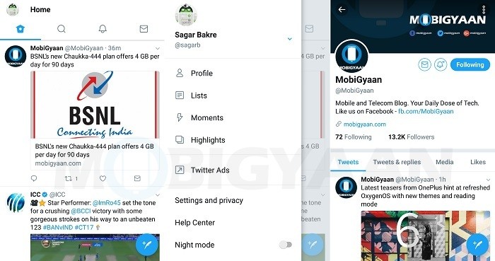
Earlier this week, we told you that Twitter was testing a new rounded UI with the beta users. Well, it seems Twitter is done with the testing now as it has announced this new rounded UI for web and mobile apps.
https://twitter.com/Twitter/status/875337970953224197
The UI of Twitter across the web as well as the mobile apps is more rounded now. The icons at the top of your Twitter feed in the app and in the side menu look minimalist. Twitter has even changed the icons in the Tweets as previous icons used to confuse the users. For example, users often mistook the arrow for replying to a Tweet as the back button. Hence, that arrow for replying to a Tweet is now replaced with a speech bubble.

Besides, Twitter has also made their typography more consistent and have made the headlines bolder so that it’s easier to read. Apart from that, the profile photos also appear in a circular shape, not just in your news feed, but also on the profile page.
Moreover, while live retweet and like counter has been there on Android app for a while now, Twitter has now brought it to the iOS app as well. Speaking of iOS, the links to articles and websites will now open in Safari’s viewer within the Twitter app, making it easier for you to access accounts on the websites that you are already signed in to.
These changes are rolling out across Twitter.com, Twitter for iOS, Twitter for Android, TweetDeck, and Twitter Lite, and, all the users should be able to see these design changes in the coming days.
Download Link: Twitter for iOS | Twitter for Android

