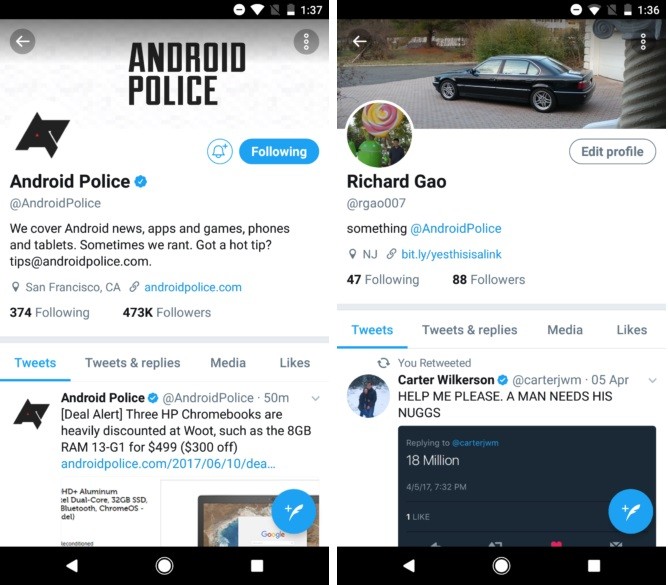
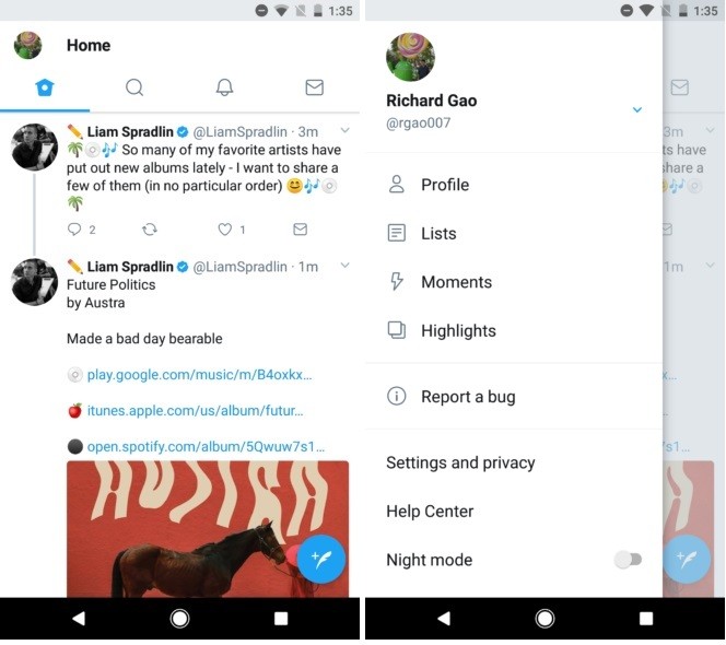
Beta users testing the Twitter app for new features have seen a slight UI design change. The update will happen through a server-side change so you don’t need to update it yourself. Like other big apps on the Play Store, Twitter has a community of beta-testers. They test new features and give feedback to Twitter app developers. This particular UI design change has been tested before in the alpha app.

Just like WhatsApp did some time ago with its Android app, Twitter is also making everything round in version 7.0. So instead of the square profile picture, now you have a round profile picture. Also, the icons are rounded as well. The “Edit Profile” button has also been rounded. Further, most of the icons including the ones from the side-drawer are now white in colour just outlined with gray or blue borders. Personally, I don’t like the rounded UI since it cuts down most details in the profile image and also makes the profile image look much smaller.

Keep in mind, these changes are just in a beta-testing phase and we might not see them rolled out to the stable version for users worldwide. If you want to enter the beta program, we are sorry to say it has closed for now.
