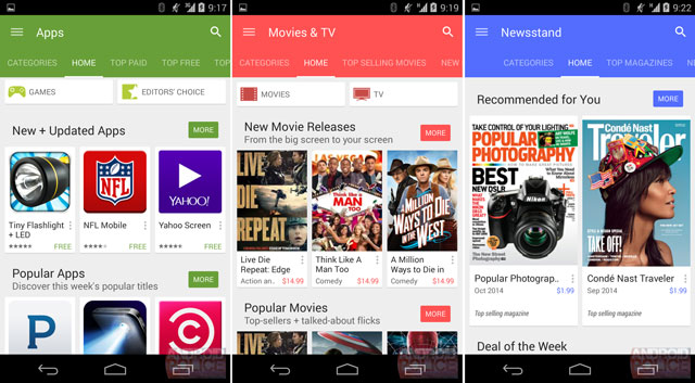
While we recently saw an update for the Google Play store with a partial material design, the company seems to be ready with the complete redesign.

The Google Play store with a complete material design update has just leaked. The updated version is definitely more aesthetically pleasing. While the content placement is nearly the same, there are major changes in the colours and the UI. To start with, the colours of the menus are dark and flashy. Similarly, the typography is slightly stronger.
Interestingly, the app icons of the various sections are modified. They are made flat but with more colour. Considering Google is ready with the design, we should see these changes in the next major update for the Google Play store which would take it to the version 5.0. However, we cannot be sure about the timeline but we can expect the updates anytime soon.

