Meta-owned WhatsApp, the popular messaging platform, today announced significant updates including a revamped interface with a fresh look, new color palettes, icons, improved dark mode, and enhanced design features. These updates represent the most substantial redesign of WhatsApp since 2021, aiming to provide users with a refreshed, approachable, and simple experience.
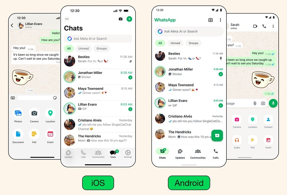
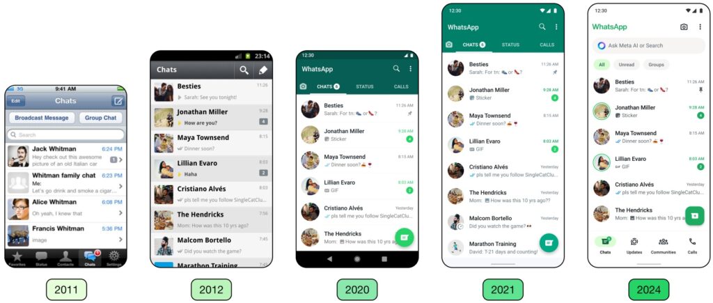
Announcing the updates, Idit Yaniv, VP and Head of WhatsApp Design at Meta, stated, “Our design philosophy aligns with our product principles of maintaining WhatsApp’s simplicity, reliability, and privacy. We filter these principles through a design lens to create intuitive and clear flows that universally facilitate connections while safeguarding privacy.
We closely observe how people interact with their devices, ensuring our user interface complements their existing experiences, thereby making WhatsApp feel familiar and effortless to navigate. If you’re familiar with using your device, using WhatsApp should be a easy.”
The redesign process was guided by three key principles outlined by Meta:
- Freshness: The goal was to make WhatsApp feel new and enjoyable, with a visual design that seamlessly integrates with users’ devices.
- Approachability: Meta aimed to ensure that WhatsApp remains easy for everyone to use, with a friendly and familiar feel.
- Simplicity: The design approach focused on creating a straightforward interface that adapts well to different devices and is prepared for future enhancements.
New Color Palette
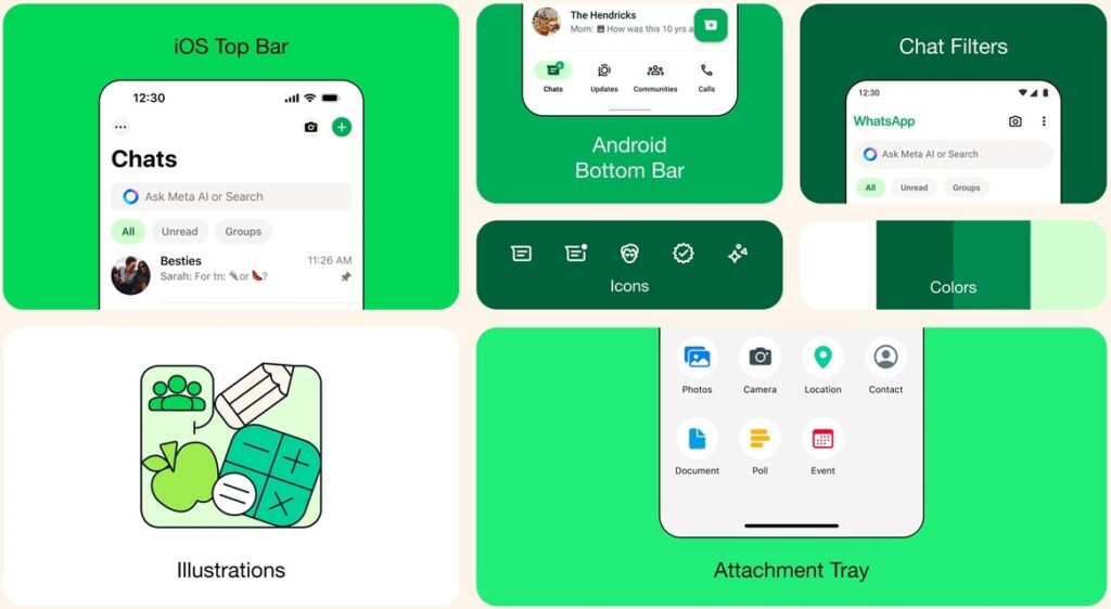
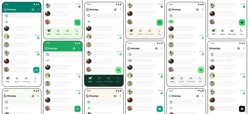
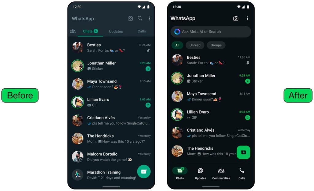
WhatsApp now features a new green color palette, carefully selected from over 35 options to provide a more consistent visual experience while retaining the platform’s iconic green hue. The updated palette incorporates neutral colors for increased flexibility. Additionally, the dark mode has been enhanced with higher contrast and deeper tones to reduce eye strain in low-light environments.
Updated Icons and Illustrations
Icons have been redesigned with a rounded, outlined style to align with the platform’s new aesthetic. Refreshed illustrations, including animated elements, add a playful touch to the user experience. Chat backgrounds have also been redesigned with simpler designs that better reflect diversity.
Easier Navigation
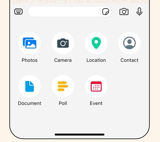
Android users will notice a modern bottom navigation bar for faster access to features, with tabs positioned closer to the user’s thumb for improved navigation. iOS users can look forward to a new attachment layout, making it easier to send media, polls, documents, and more.
Improved Chat Management
Building on the recently introduced chat filters, WhatsApp now enables users to focus on important conversations more efficiently. Chat filters are conveniently placed at the top of the chat list, allowing users to switch between unread and group filters with ease.
Designing for the Future
Meta highlights the collaborative effort behind these updates, involving a multidisciplinary team of designers. The company expresses enthusiasm for users to explore the refreshed WhatsApp experience and reaffirms its commitment to enhancing connectivity through the platform.

