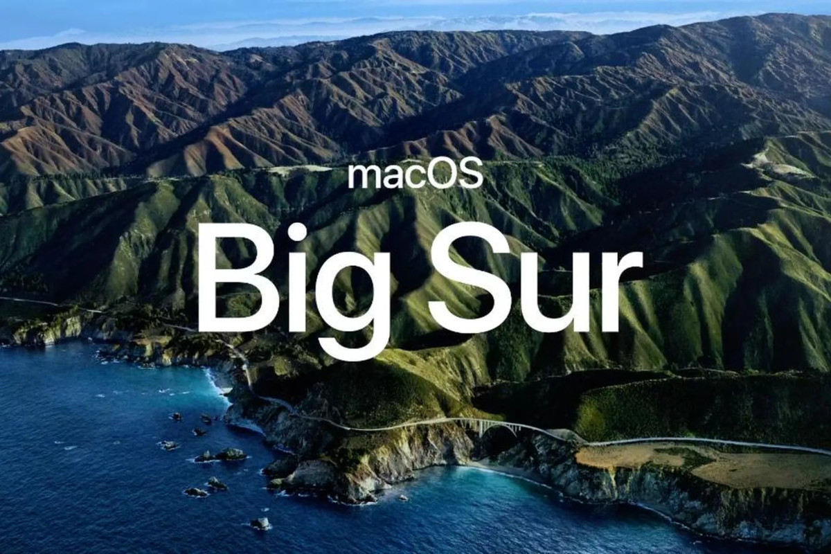
Apple has unveiled its next major macOS release — macOS 11 Big Sur. Continuing the trend, this new version has been named after a region in California. This new version also comes with a major design overhaul.

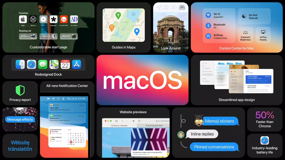
The company says that the macOS Big Sur comes with “entirely new interface” along with “refinements in buttons and controls” and new unified icon set. The Finder now has a more transparent sidebar on the left with a solid main section to the right side.
It has added a few elements from the iOS, such as a customizable Control Center for toggling brightness, Do Note Disturb mode among other settings. There’s also a new notification center that tracks organizes all the notifications and widgets.
The company has also made the menu bar a taller and more transparent. Also, the font color changes based on the background and the drop-down menu is also larger with extra white space between lines and the windows have a more rounder edge.

Native applications from Apple, including Mail, Photos, News, and iWork also comes with this new design. The Messages app has also got a new feature as well as inline replies along with customizable icons and @-sign mentions for group chats.
The new macOS Big Sur also bring the biggest Safari feature which the company claims can load popular websites about 50 percent faster. It is also claimed to be easier on battery compared to Chrome.
It also comes with a customizable start page and a built-in automatic translation feature. The app gets support for extensions made for other browsers, and a dedicated extension store in the App Store.
The update also brings new privacy features which can generate Privacy Report. From what’s announced, it seems that the new macOS is focused on updating the user interface and modernizing the visual design.

