Whenever Apple has come out with a new iPhone, aside from the hardware, the software has made major leaps. Apples sets off its product launch season by introducing an iOS update and the recent iOS 7 update is no different, although only the beta versions are available now. While the beta version was announced sometime back, the much-improved Beta2 popped up recently.

Every iOS update is designed according to the hardware of recent phones and somewhere along the line a certain kind of phone stops updating every time a new phone is released – this iOS update will serve the owners of iPhone 4 and later (iPhone 3G loses out), iPad 2 and later (iPad loses out, iPad Mini included and iPod Touch 5th generation up.
It is no secret that Apple is a show-off and now that Samsung has upped its ante on visual features, Apple doesn’t want to stay behind.
Some features look good but don’t simply charm our pants off though – such as the hands on control panel or the rumoured smile to unlock feature that Samsung came up with ages ago. But, still there is much to look forward to.
We present you with our take on it, bit by bit:
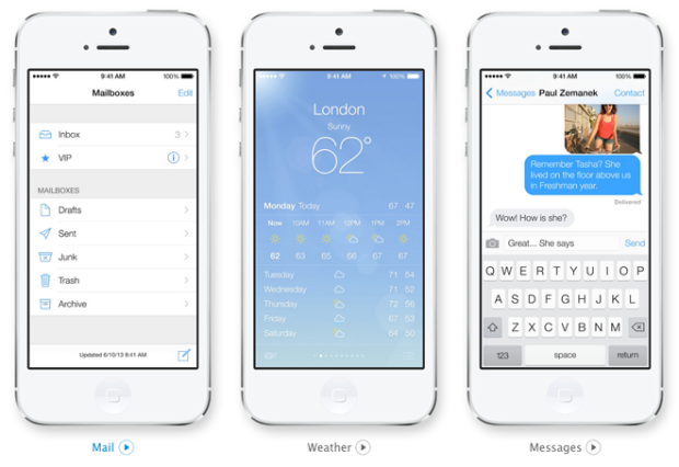
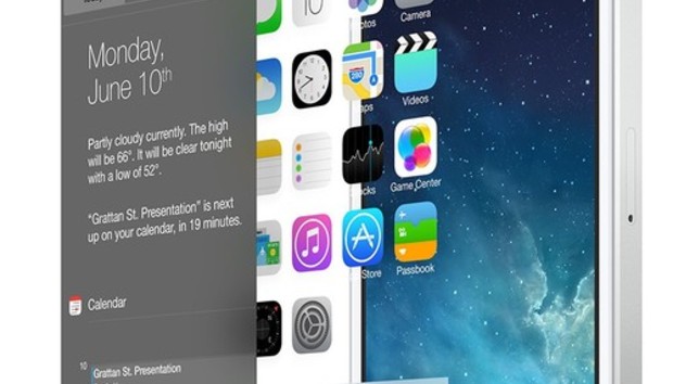
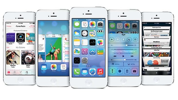
Design: Design is the big leap of faith that Apple has undertaken – it has ditched the earlier Skeuomorphic (App tiles) design that we have grown so ordained to seeing – this was the design that Android and so many others took inspiration from first, then chucked it and move on. Seems Apple too doesn’t want to remain stuck back in time. It has gone for a flatter UI this time, which many people either revolutionary or just plain horrible depending on whom you are talking to. We are in awe actually since the new OS features has translucent colours dancing in the background while you do your thing. While some people might still lust after an old-school, we find the new interface much cleaner and altogether much more user friendly.

Virtual Back button: Many handsets have a back button, but Apple has stuck to its philosophy of the single home button on the phone. Without moving away from that philosophy, Apple has included a virtual back button in the package – it is actually more of a gesture. All you need to do is swipe in from the left side of the phone. You can use it with Safari, Mail and pretty much anything else

Revamped default apps: Default i.e. original apps from Apple have undergone some changes that make the iPhone the treat that it is. The Calendar app lets you see days and as soon as you switch to landscape mode, you will see the week. Zoom out a bit and you will see the month. Safari is proving its mettle as a browser with 3d-esque tab switching, better bookmarking and Twitter integration to list some features. The camera will have built in features that have taken out a page from Instagram’s book.

Photo app: While we were swayed by the iPhone 5 8-megapixel camera, we are hoping Apple outdoes itself with the upcoming iPhone (6, 5s whatever it is called). It organizes photo into ‘moments’ by time and location. It auto-labels places that you visit. The views are much better and you can easily go in, get out of the photo gallery. You can also Airdrop your photos to other iPhone users and update Facebook, Twitter and Flickr via iCloud.

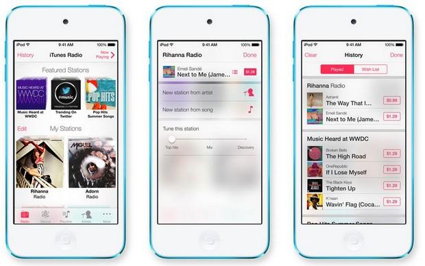
iTunes Radio: iTunes Radio has always existed in the background and you could always access it via iTunes and internet, but we never paid it any attention in the past, nor did Apple to be honest. It has now been built into a Pandora-like experience and features the huge iTunes music catalogue. You can also tune in and set preferences. The best feature though is that it easily connects to the iTunes store where you can make wish lists or purchase any tracks you like.

Apple also has much else in store like a smarter Siri, Anti-theft features like Find My iPhone and greatly improved notifications along with much else. But the real test of this OS will be when the new iPhone comes along. Watch this space for updates.
